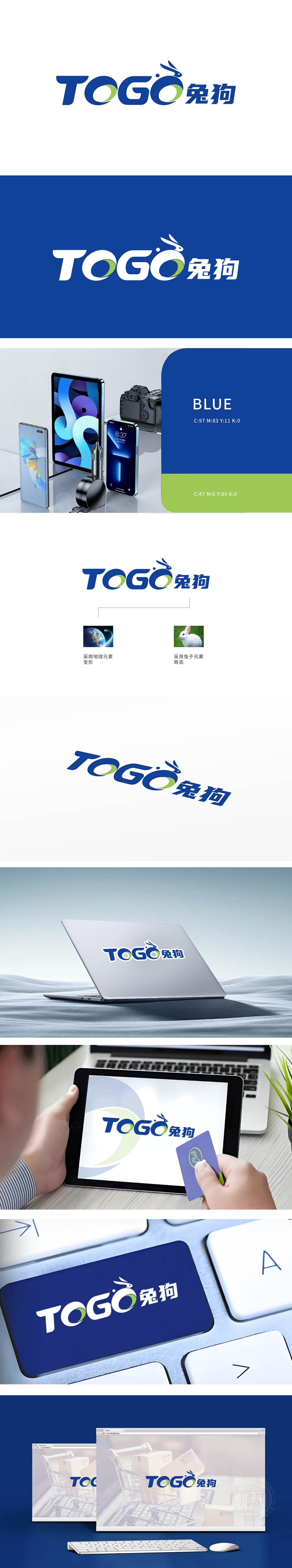
狮动设计通过对“兔头”图形抽象线条勾勒,耳朵上扬、鼻头小巧,整体呈现灵动“萌态”,可拉近品牌与用户的情感距离,兔子作为“敏捷、灵活”的象征,暗合数码产品“高效、便捷”的功能属性,字母采用无衬线字体,字形饱满稳重,蓝色主调传递科技感与可靠性,符合数码电子行业对专业、信任的视觉需求。字母“O”融入绿色环形设计,既打破纯蓝色的沉闷,又暗示“连接循环数据流转),增强视觉记忆点。整体将“科技蓝”“萌宠IP”“全球化(地球变形)”三大元素自然结合,既满足数码电子行业对“专业感”的需求,又通过萌系形象构建差异化记忆点,展现对“商业目标+用户心理”的双重洞察。
Lion-action design outlines the abstract lines of the "rabbit head" figure, with raised ears and small nose, showing a smart "budding state" as a whole, which can close the emotional distance between the brand and users. Rabbit, as a symbol of "agility and flexibility", coincides with the functional attributes of "efficiency and convenience" of digital products, with sans-serif fonts for letters, full and steady fonts, and the blue theme conveys the sense of science and technology and reliability, which is in line with the digital electronics industry.The letter "O" is integrated into the green ring design, which not only breaks the dullness of pure blue.


扫码或拨打添加客服微信


