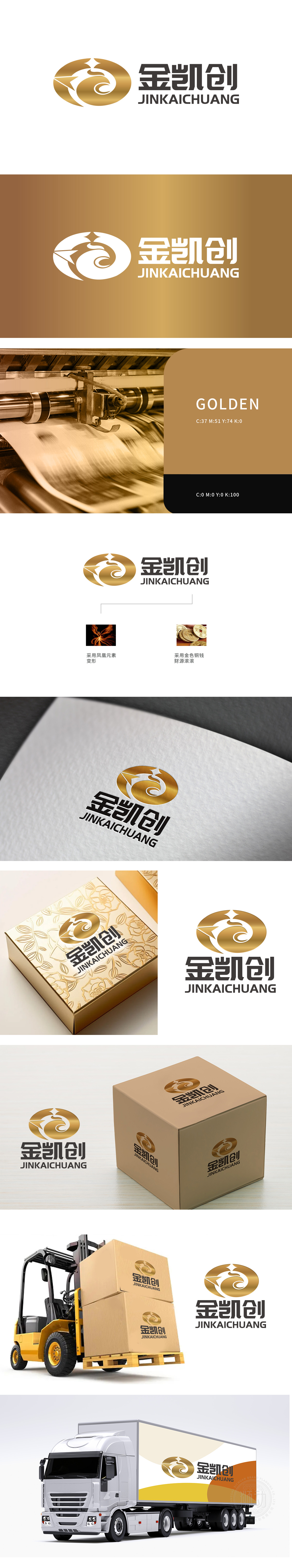
狮动设计以抽象凤凰为核心,昂首向上的动态线条搭配顶部星形符号,既保留凤凰“吉祥、高贵、重生”的文化寓意,又通过流畅曲线传递企业锐意进取的生命力,与“金凯创”名称中“创”字的创新精神形成呼应。整体采用金属光泽的金色调,结合右侧“金色铜钱”备注,暗合“财源滚滚”的商业愿景。环形轮廓包裹凤凰图形,既象征圆满与包容,又暗藏“以创新(凤凰)驱动财富(铜钱)”的品牌逻辑,视觉上形成“内外相生”的层次感。整体采用金色+曲线”的视觉基因,形成“高端、吉祥、专业”的品牌印象。
Lion Design takes the abstract Phoenix as the core, and the dynamic lines with heads held high and the star symbol at the top are matched, which not only retains the cultural implication of Phoenix's "auspiciousness, nobility and rebirth", but also conveys the enterprise's enterprising vitality through smooth curves, echoing the innovative spirit of the word "Chuang" in the name of "Jin Kaichuang". The overall use of metallic gold tone, combined with the right side of the "golden copper coin" remarks, coincides with the "rolling financial resources" business vision.


扫码或拨打添加客服微信


