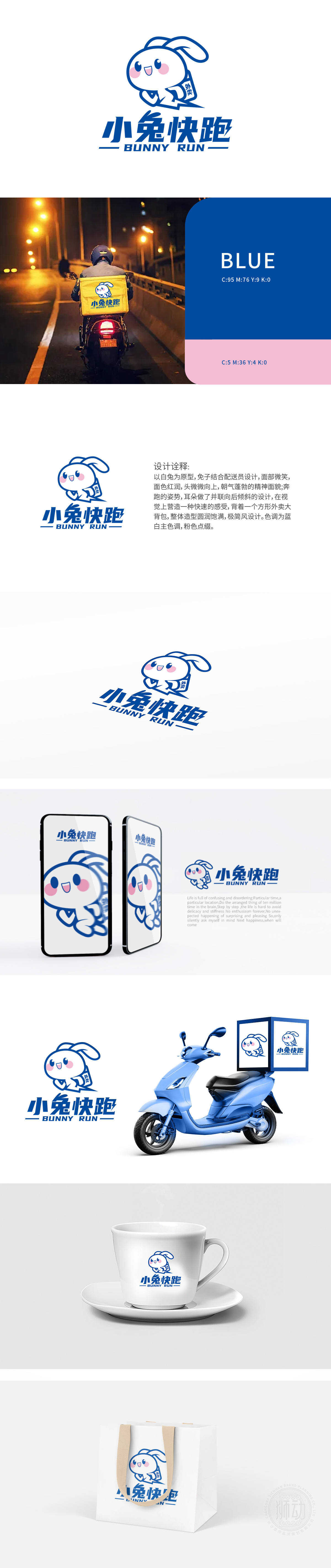
狮动设计通过“兔子”为原型,构建外卖快递的“速度+亲和”双重认知速度感的视觉强化,奔跑姿态:兔子本身是敏捷、快速的动物象征,LOGO中兔子四肢前伸、身体前倾的动态线条,直观传递“快跑”的配送属性;耳朵“并联向后倾斜”的设计,如同高速运动中向后拉扯的流线型,进一步强化视觉速度感,契合外卖快递对“时效性”的核心需求。“面部微笑、面色红润、头微微向上”的设计,赋予兔子配送员的人格化特征——既像亲切的“邻家小哥”,又传递出“积极、朝气”的服务状态,蓝色设计契合快递服务对“安全性、规范性”的需求;白色代表“干净、卫生”,贴合外卖行业对食品配送的基础要求,色彩组合传递“高效且安心”的服务形象。
Lion design takes "rabbit" as the prototype to construct the dual cognition of "speed+affinity" of take-away express delivery.Visual enhancement of speed sense, running posture: the rabbit itself is an agile and fast animal symbol, and the dynamic lines of the rabbit's limbs stretching forward and leaning forward in LOGO convey the distribution attribute of "running fast" intuitively; The design of "parallel-connected and backward-inclined ears", like the streamline of pulling backward in high-speed movement, further strengthens the sense of visual speed and meets the core demand of "timeliness" for take-away express delivery.The design of "smiling face, rosy face and slightly upward head" endows the rabbit delivery staff with personalized characteristics-not only like a kind "little brother next door"


扫码或拨打添加客服微信


