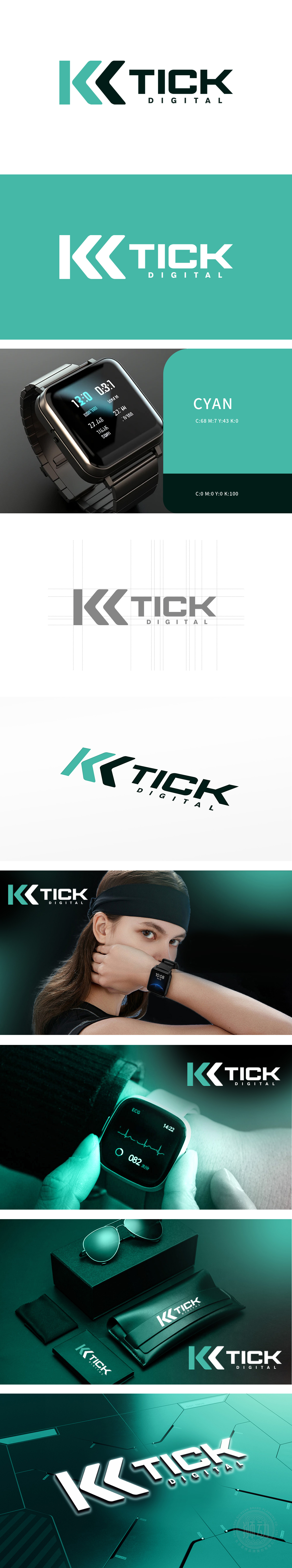
狮动设计以抽象化的“K”字母为核心视觉符号,通过双箭头动态组合构建主体:青绿色块:采用圆润流线型设计,边缘平滑且带有向右的弧度,形似动态曲线,传递“运动中的流畅感”;黑色箭头:锐角切割的几何形态,形成强烈的“递进”“冲刺”视觉动势,双符号组合:青绿色与黑色形成软硬对比,既像运动中的轨迹,又暗喻“科技(黑)赋能健康(青绿)”的产品逻辑,青绿+黑色的组合传递“健康活力”与“科技可靠”的双重信任,符合运动人群对“专业装备”的心理期待。
Lion design takes the abstract "K" letter as the core visual symbol, and constructs the main body through the dynamic combination of double arrows: turquoise block: rounded and streamlined design, smooth edge with right radian, shaped like a dynamic curve, conveying "the sense of fluency in motion"; Black arrow: the geometric form of acute angle cutting forms a strong progressive and sprinting visual dynamic. Double symbol combination: turquoise and black form a soft-hard contrast.


扫码或拨打添加客服微信


