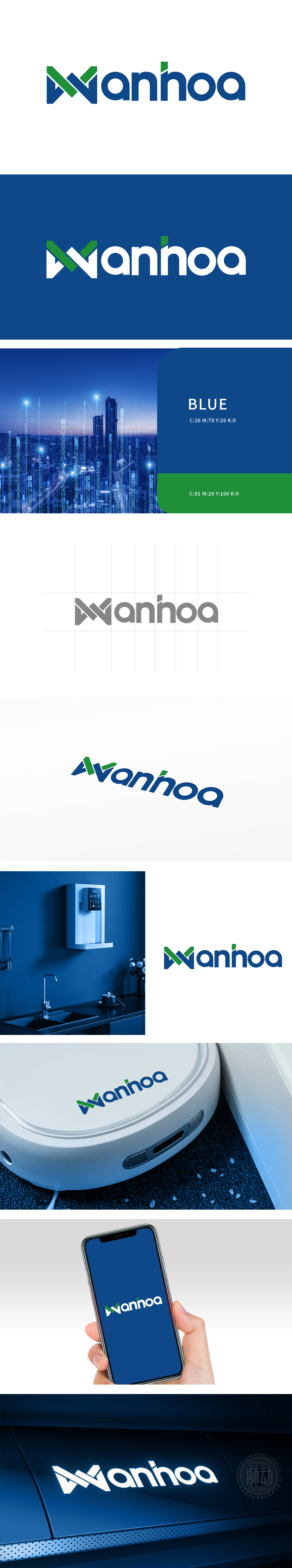
狮动设计抽象化的“W”为核心视觉符号,由深蓝色几何折线与绿色斜向交叉线条构成:蓝色折线呈对称的“V”形结构,线条刚直利落,传递电子家电产品的科技感、稳定性与精密工艺;绿色斜线以45°角贯。深蓝色代表专业、可靠,符合电子家电品牌对“品质”的核心诉求;绿色作为辅助色,强化环保、智能的品牌联想,贴合当下家电行业“绿色科技”的趋势。整体通过硬朗的线条、沉稳的色彩,快速建立“技术可靠”的品牌印象。
The abstract "W" of Lion Motion Design is the core visual symbol, which is composed of dark blue geometric polylines and green oblique crossing lines: the blue polyline is in a symmetrical "V" structure, and the lines are straight and neat, conveying the scientific sense, stability and precision technology of electronic home appliances; The green diagonal line crosses at an angle of 45. Dark blue represents professionalism and reliability, which conforms to the core demands of electronic home appliance brands for "quality";


扫码或拨打添加客服微信


