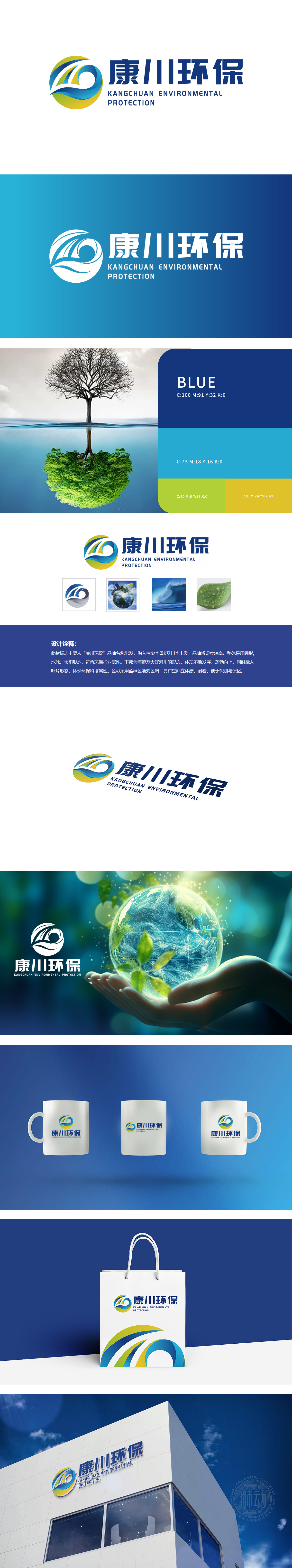
狮动设计从品牌名称“康川环保”出发,抽象融入首字母“K”与“川”字的字形结构,使图形兼具品牌专属性与行业辨识度。采用圆形设计,暗合地球形态,象征全球生态与环保的宏观视角。内部流动的曲线形成闭环结构,既呼应“环保”领域的“可持续发展”“循环经济”理念,也通过动态线条传递“生生不息”的自然生命力,与底部“绿叶形态”的局部设计相呼应,强化环保行业“生态保护”的核心属性。图形同 时以流畅的蓝绿色渐变线条模拟“海浪”与“大河川”的形态,直接关联环保领域中的“水资源保护”“水环境治理”等核心业务。字母“K”的线条向上延伸,与波浪形态结合,形成“蓬勃向上”的动态感,既象征企业在环保领域的进取精神,也隐喻通过技术创新推动生态环境“持续向好”的发展愿景。
Starting from the brand name "Kangchuan Environmental Protection", Lion Motion Design abstractly incorporates the glyph structure with the initials "K" and "Chuan", so that the graphics have both brand specificity and industry recognition. The circular design coincides with the shape of the earth, symbolizing the macro perspective of global ecology and environmental protection. The curve of internal flow forms a closed-loop structure, which not only echoes the concept of "sustainable development" and "circular economy" in the field of "environmental protection", but also conveys the endless natural vitality through dynamic lines, echoing the local design,of "green leaf form" at the bottom, and strengthening the core attribute of "ecological protection" in the environmental protection industry. At the same time.


扫码或拨打添加客服微信


