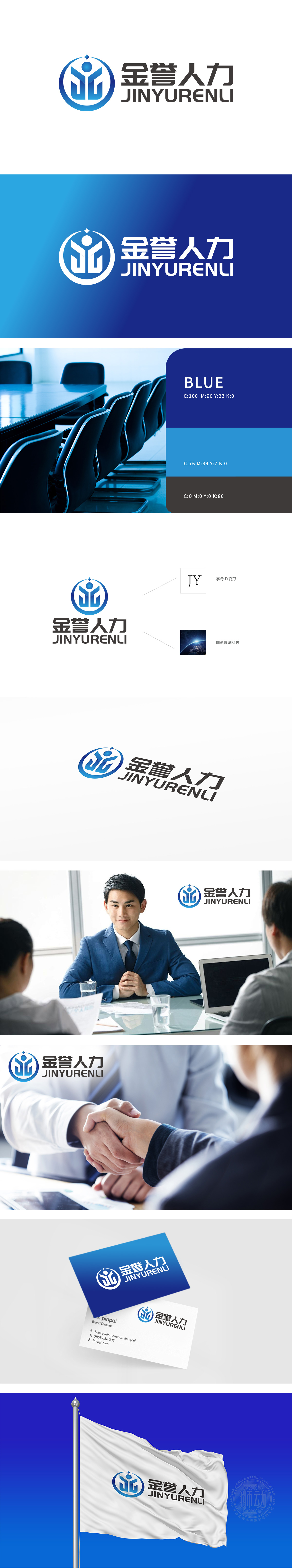
狮动设计以“金誉人力”拼音首字母“JY”为核心,通过抽象线条融合“人”形轮廓,既突出品牌专属标识,又直观体现“人力”行业属性。“J”与“Y”的线条以向上延伸的姿态组合,形成环抱感,象征企业对人才的赋能与支持,传递“以人为本”的服务理念。外层蓝色渐变圆形轮廓,寓意“圆满、包容”,呼应“金誉”的“誉”字所代表的信誉、口碑;圆形边缘的科技感光晕,则赋予品牌现代科技属性,暗示人力资源服务的数字化、智能化升级。整体设计实现了“行业属性+品牌个性+视觉美感”的统一,精准匹配人力资源企业“专业服务+创新驱动”的双重需求。
Lion Design takes the initials JY of "Jinyu Manpower" as the core, and integrates the outline of "human" through abstract lines, which not only highlights the brand-specific logo, but also intuitively reflects the industry attribute of "manpower".The lines of "J" and "Y" are combined in an upward posture, forming a sense of embracing, symbolizing the empowerment and support of enterprises for talents and conveying the service concept of "people-oriented". The outer blue gradient circular outline means "perfection and tolerance", echoing the reputation and reputation represented by the word "reputation" of "golden reputation";


扫码或拨打添加客服微信


