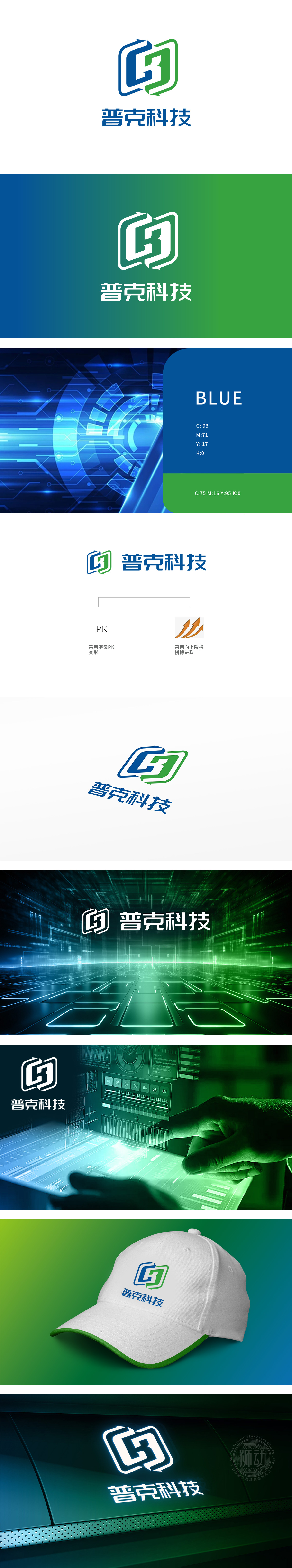
狮动设计采用字母“P”的变形蓝色外框,象征技术框架与边界突破,嵌套绿色“K”的局部轮廓,象征科技赋能与可持续发展,两字母通过折线结构紧密咬合,形成“互锁”视觉效果,暗合“普克”(PK)名称,强化品牌记忆点。折线角度锐利且富有动感,突破传统对称结构,传递科技企业“打破常规、创新进取”的精神;蓝绿配色对比鲜明,蓝色代表专业、信任,绿色象征活力与未来感,符合互联网行业对“科技+生态”的双重追求。整体既通过“PK”变形实现名称可视化,又以色彩、线条、辅助图形传递“科技、进取、可靠”的品牌人格,形成兼具识别性与情感共鸣的视觉符号。
Lion Design adopts a blue deformed frame with the letter "P", symbolizing the breakthrough of technical framework and boundary, and embedding a partial outline of green "K", symbolizing the empowerment of science and technology and sustainable development. The two letters are closely meshed through the broken line structure, forming an "interlocking" visual effect, coinciding with the name of "PK" and strengthening the brand memory. The angle of broken line is sharp and dynamic, which breaks through the traditional symmetrical structure and conveys the spirit of "breaking the routine, innovating and enterprising" of science and technology enterprises; Blue and green are in sharp contrast, blue represents professionalism and trust, and green symbolizes vitality and futurity.
 、
、


扫码或拨打添加客服微信


