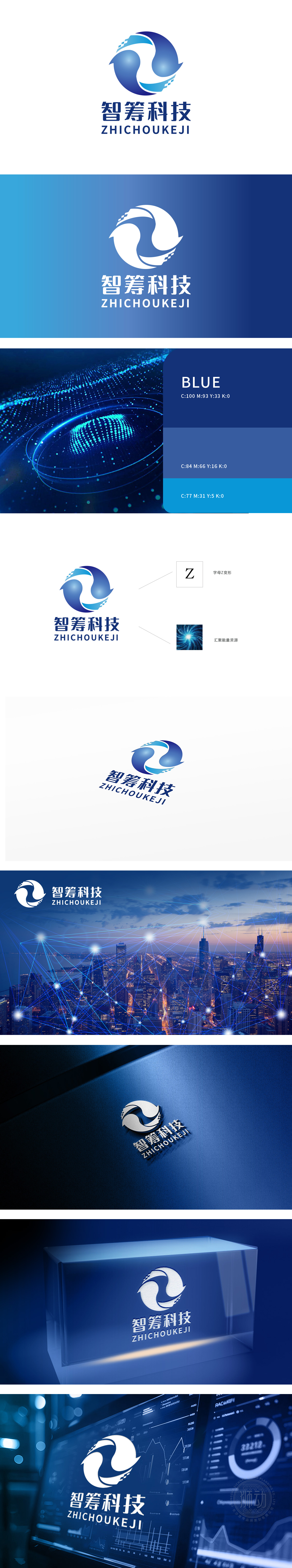
狮动设计以品牌首字母“Z”为核心基因,通过流动的双螺旋环绕,双螺旋中间的留白形成“∞”(无限符号)的视觉联想,暗合“智筹科技”在资源整合、数据循环上的“无限可能”,强化品牌“科技赋能”的核心定位。“智”:图形的流动感象征“智慧算力”的动态运转,蓝色渐变隐喻“数据深度与科技底蕴”;“筹”:双螺旋汇聚的构图直观诠释“资源整合、多方协同”,呼应互联网平台“连接供需、优化配置”的核心价值。整体通过“字母基因+行业形态+理念隐喻”的三维设计逻辑,契合互联网行业“高效连接、持续迭代”的特性。视觉上传递“开放、融合”的品牌气质。
Lion Design takes the brand initials "Z" as the core gene, and it is surrounded by a flowing double helix, and the blank space in the middle of the double helix forms the visual association of "∞" (infinite symbol), which coincides with the "infinite possibility" of "intellectual technology" in resource integration and data circulation, and strengthens the core positioning of the brand "technology empowerment". "Wisdom": the fluidity of graphics symbolizes the dynamic operation of "intelligent computing power", and the blue gradient metaphor "data depth and scientific and technological connotation"; "Financing".


扫码或拨打添加客服微信


