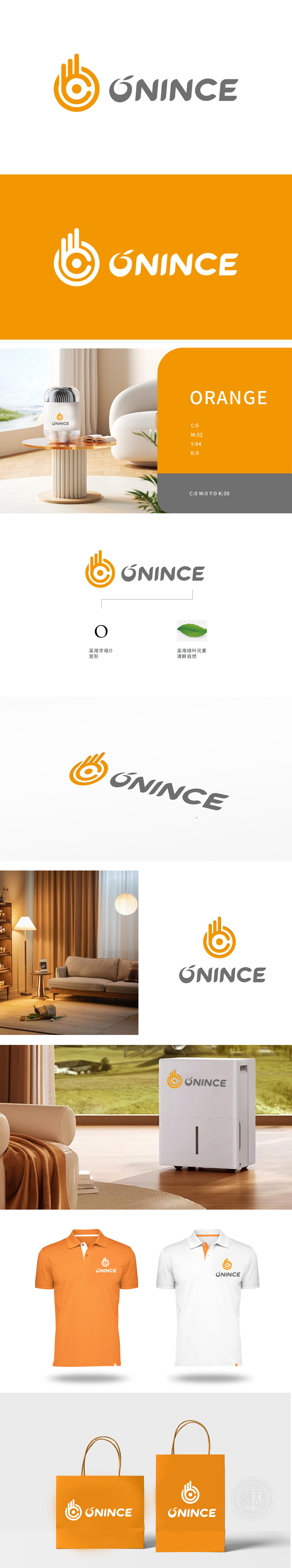
狮动设计以品牌名称首字母“O”为创意原点,通过多层环形线条与抽象化“手掌”轮廓的融合,巧妙呼应家电产品的“操控性”(如旋钮、触控)与“服务感”,橙色主色调传递温暖、活力的品牌气质,多层同心圆设计既象征家电产品的精密科技感,也隐喻品牌对品质的“环绕式”守护;中心圆点强化聚焦感,暗示精准、高效的产品性能。整体设计通过“字母变形+具象化意象”的双重编码,构建了“温暖科技+健康生活”的品牌认知,精准定位注重生活品质、追求科技与自然平衡的家电消费群体;
Lion design takes the initial "O" of the brand name as the creative origin, and through the fusion of multi-layer circular lines and abstract "palm" contours, it skillfully echoes the "controllability" (such as knob and touch) and "sense of service" of household appliances. The orange main color conveys the warm and energetic brand temperament, and the multi-layer concentric circle design not only symbolizes the precise sense of technology of household appliances, but also symbolizes the "surrounding" protection of the brand on quality. The central dot enhances the sense of focus and implies accurate and efficient product performance.


扫码或拨打添加客服微信


