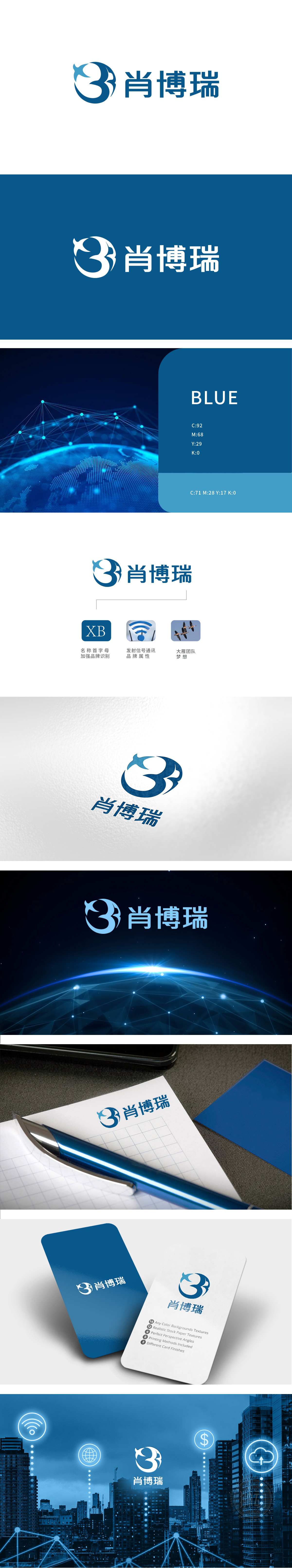
狮动设计以蓝色为基调,主体图形由流畅的曲线构成数字“3”的形态,右侧巧妙融入抽象飞鸟轮廓(似大雁展翅),线条连贯且富有动感,既体现“肖博瑞”名称中“瑞”字的吉祥寓意,又传递“自由翱翔、锐意进取”的品牌精神。蓝色在视觉语言中代表“科技、专业、可靠”,契合通信行业的技术属性;整体设计将图形-文字-符号”三位一体巧思融入品牌价值,精准传达科技感与信任感。
Lion design is based on blue, the main figure is in the form of a number "3" with a smooth curve, and the right side is ingeniously blended with the abstract bird outline (like a wild goose spreading its wings). The lines are coherent and dynamic, which not only embodies the auspicious meaning of the word "Rui" in the name of "Xiao Borui", but also conveys the brand spirit of "flying freely and forging ahead". Blue stands for "science, technology, professionalism and reliability" in visual language, which accords with the technical attributes of communication industry;


扫码或拨打添加客服微信


