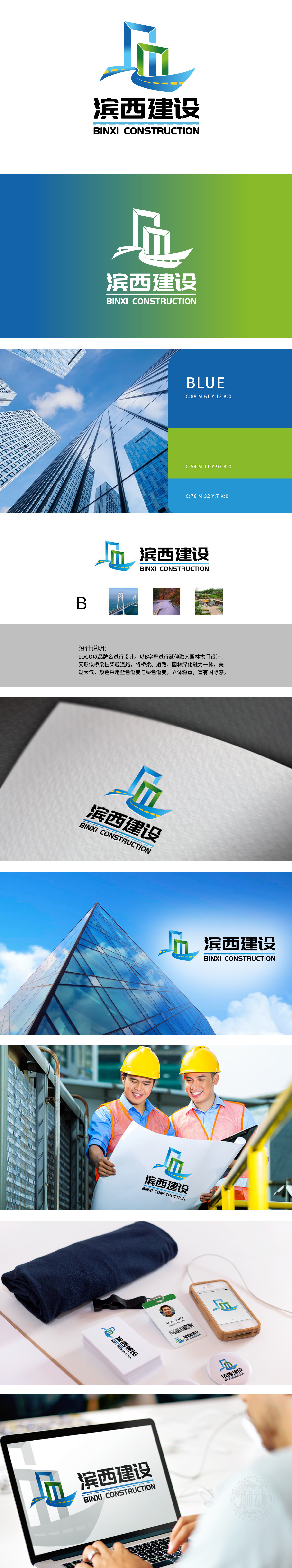
狮动设计以品牌名首字母“B”为创意起点,通过线条延伸与结构重组,巧妙融合了建筑场景,线条硬朗且富有力学美感,传递“架连通达”的工程属性。中间黄色虚线贯穿的蓝色波浪线条,模拟道路中线,与右侧“蜿蜒道路”配图呼应,象征施工建设中的交通网络延伸。整体设计从“建筑骨架”到“视觉骨架”,以符号承载业务逻辑”的精准性。
Lion Design takes the brand initials "B" as the creative starting point, and through line extension and structural reorganization, it skillfully blends architectural scenes, with tough lines and rich mechanical beauty, and conveys the engineering attribute of "connecting and reaching". The blue wavy line running through the yellow dotted line in the middle simulates the middle line of the road and echoes the map of the "winding road" on the right, symbolizing the extension of the traffic network under construction..


扫码或拨打添加客服微信


