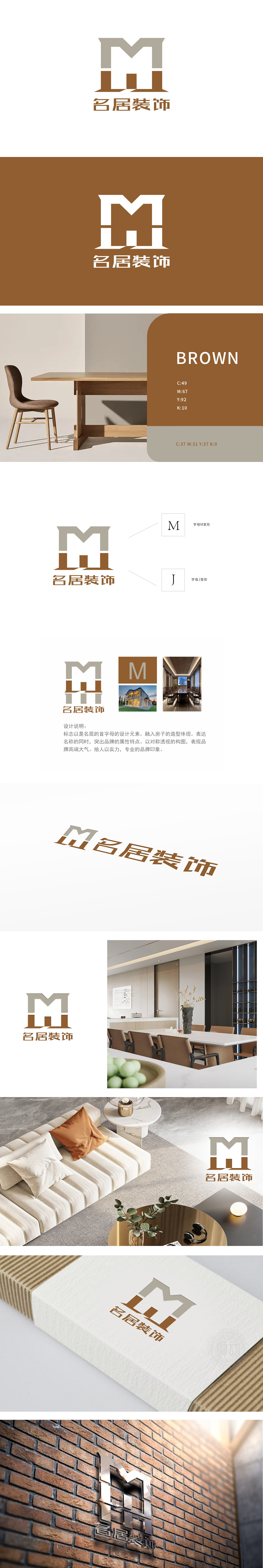
狮动设计采用字母“M”与“J”的创意解构,顶部以浅灰色呈现“M”的变形,线条采用对称的三角形折线设计,既保留了字母“M”的识别性,又通过棱角分明的结构模拟房屋屋顶、横梁的形态,呼应“名居装饰”中“居”(居住空间)的核心属性,传递出“构筑家园”的行业联想,M+J”的一体化构图两个字母通过上下叠加、色块拼接形成整体图形,巧妙呼应品牌名称“名居”,实现“图形即品牌符号”的记忆点,同时通过“屋顶+墙体”的视觉联想,直观传递“家居空间打造”的业务核心,结构美学与安全感并存。
Lion design adopts the creative deconstruction of the letters "M" and "J", with the deformation of "M" in light gray at the top and symmetrical triangular broken lines, which not only retains the recognition of the letter "M", but also simulates the shape of the roof and beams of the house through angular structures, echoing the core attribute of "residence" (living space) in "famous residence decoration" and conveying "building home" The integrated composition of M+J "two letters form a whole graph by overlapping up and down and splicing color blocks, which skillfully echoes the brand name" Mingju "and realizes the memory point of" graph is brand symbol ".


扫码或拨打添加客服微信


