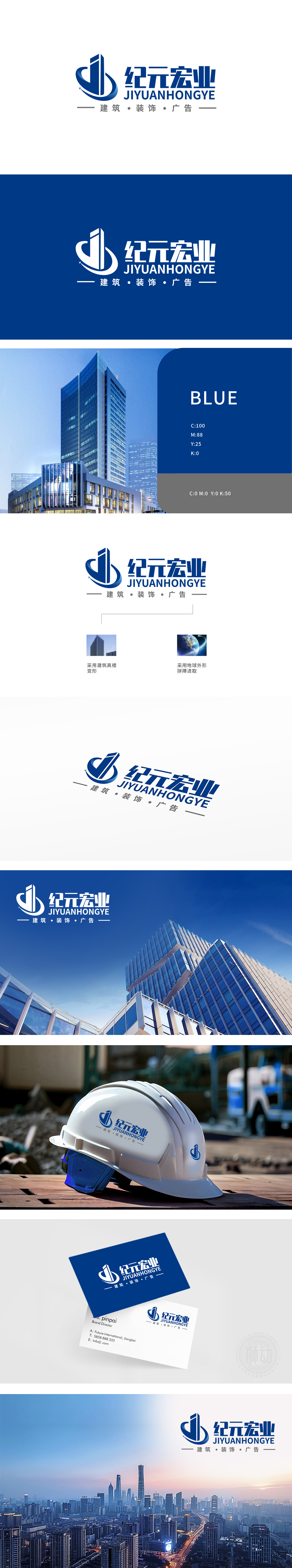
狮动设计以建筑高楼轮廓为原型,通过几何化变形形成纵向挺拔的“1”字形态,既象征高楼大厦的高耸感(对应“建筑·装饰”业务),又暗含“行业标杆、领先”的品牌定位。线条采用硬朗的直线与斜面切割,传递建筑行业的专业、稳固与精准,同时蓝色渐变增强现代感与科技属性,打破传统建筑品牌的厚重感,赋予轻盈向上的视觉张力。设计通过“建筑形态的符号化提炼”与“地球意象的抽象化融合”,既直观传递了建筑、装饰、广告的业务属性,又以“向上的高楼+环绕的地球曲线”构建了“稳固根基、全球视野”的品牌形象。
Lion design takes the outline of high-rise buildings as the prototype, and forms a vertical "1" shape through geometric deformation, which not only symbolizes the towering feeling of high-rise buildings (corresponding to "architecture and decoration" business), but also implies the brand positioning of "industry benchmark and leading". The lines are cut with tough straight lines and inclined planes, which convey the professionalism, stability and accuracy of the construction industry. At the same time, the blue gradient enhances the modern sense and scientific and technological attributes, breaks the heavy sense of traditional architectural brands, and gives light and upward visual tension. Through "symbolic refinement of architectural form" and "abstract fusion of earth image".


扫码或拨打添加客服微信


