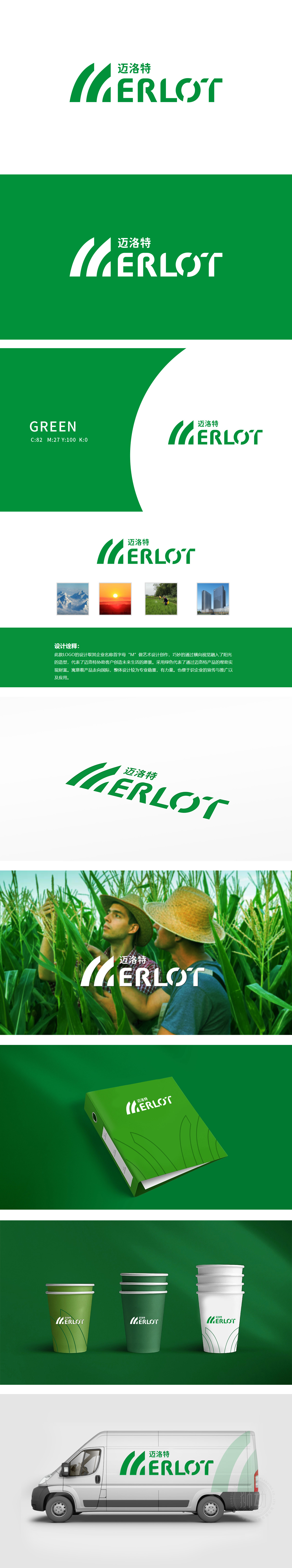
狮动设计以企业名称首字母“M”为创意原点,通过流畅的绿色曲线组合,形成类似叶片舒展、稻穗低垂 或 层叠山峦 的视觉联想。曲线的柔和弧度既模拟了农作物的自然生长态势,也暗合农牧渔业中“土地-作物-生态”的有机循环,传递出与自然共生的行业属性。代表迈洛特对绿色农业、可持续发展的追求,契合当前行业“生态种植”“有机农业”的趋势;LOGO通过“M+阳光”的组合,传递出 “赋能客户、共创丰收” 的品牌态度,也为迈洛特构建了“专业、可靠、有温度”的农牧渔业品牌形象。
Lion design takes the initial letter "M" of the enterprise name as the creative origin, and through the smooth combination of green curves, it forms a visual association similar to the stretching of leaves, the drooping of rice ears or the overlapping mountains. The gentle radian of the curve not only simulates the natural growth trend of crops, but also coincides with the organic cycle of "land-crop-ecology" in agriculture, animal husbandry and fishery, and conveys the industrial attribute of symbiosis with nature.


扫码或拨打添加客服微信


