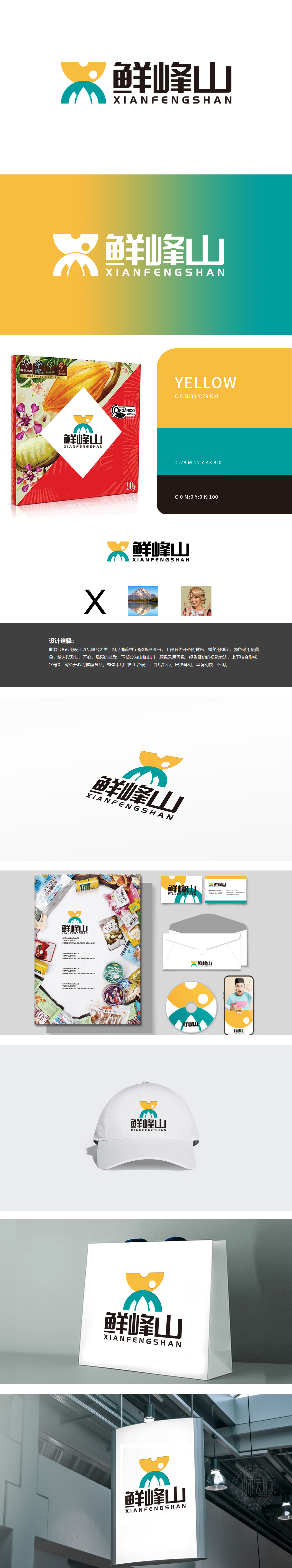
狮动设计以首字母X的创意变形,暖黄色半圆弧线模拟开怀大笑的嘴部形态,传递愉悦、活泼的情感联想,契合食品消费场景中“美味带来快乐”的核心体验,青绿色半圆弧线勾勒出山峦轮廓,既呼应品牌名“鲜峰山”中的“峰”字,又通过自然意象传递“原生态、纯净、健康”的价值主张,“鲜峰山”LOGO通过首字母变形、自然意象与情感符号的融合,精准诠释了“开心的健康食品”定位,其色彩与图形设计不仅高度适配进口食品对“自然、健康、愉悦”的核心诉求,更体现了狮动在品牌视觉转化上的专业能力——将抽象品牌价值转化为可感知、可传播的视觉语言。
Lion design uses the creative deformation of the initials X, and the warm yellow semicircle arc simulates the mouth shape of laughing, conveying pleasant and lively emotional associations, which is in line with the core experience of "delicious brings happiness" in the food consumption scene. The turquoise semicircle arc outlines the outline of mountains, which not only echoes the word "peak" in the brand name "Xianfeng Mountain", but also conveys the value proposition of "original ecology.purity and health" through natural images. The LOGO of "Xianfengshan" accurately interprets the positioning of "happy healthy food" .


扫码或拨打添加客服微信


