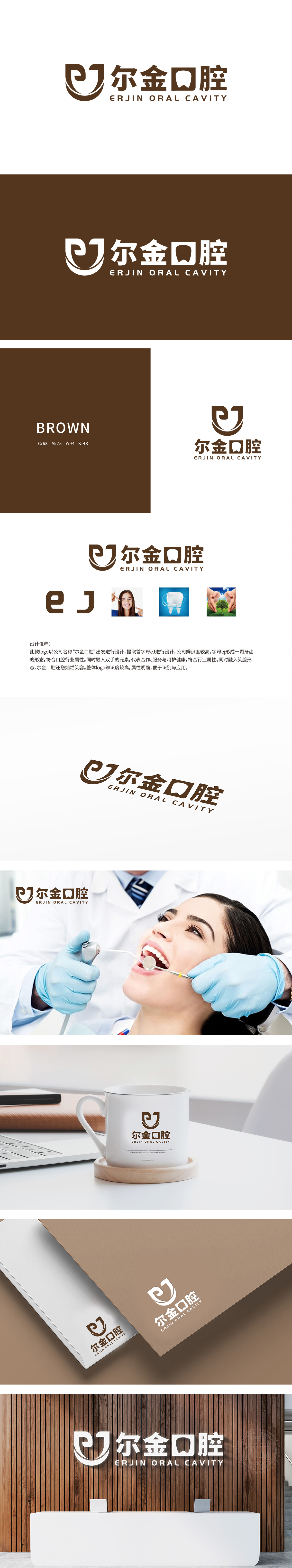
狮动设计以eJ”双字母构成牙齿轮廓,强化行业专属感,“e”的右侧开口弧度,传递“健康笑容”的品牌核心价值,实现“专业治疗”与“情感价值”的双重表达。深棕色传递“温暖、稳重、可靠”的心理感受——棕色既象征“自然、安全”,LOGO通过“牙齿图形+棕色温暖色调+双手/笑脸隐喻”,既强调“口腔治疗”的专业属性,传递“以患者为中心”的服务理念,从“治疗工具”到“健康伙伴”。
Lion design uses eJ to form the tooth outline, which strengthens the sense of industry exclusivity. The right opening radian of E conveys the brand core value of "healthy smile" and realizes the dual expression of "professional treatment" and "emotional value". Dark brown conveys the psychological feeling of "warmth, stability and reliability"-brown symbolizes "nature and safety", and LOGO emphasizes the professional attribute of "oral therapy" and conveys the service concept of "patient-centered" from "therapeutic tool" to "healthy partner" through "tooth graphics+brown warm tone+metaphor of hands/smiling face".


扫码或拨打添加客服微信


