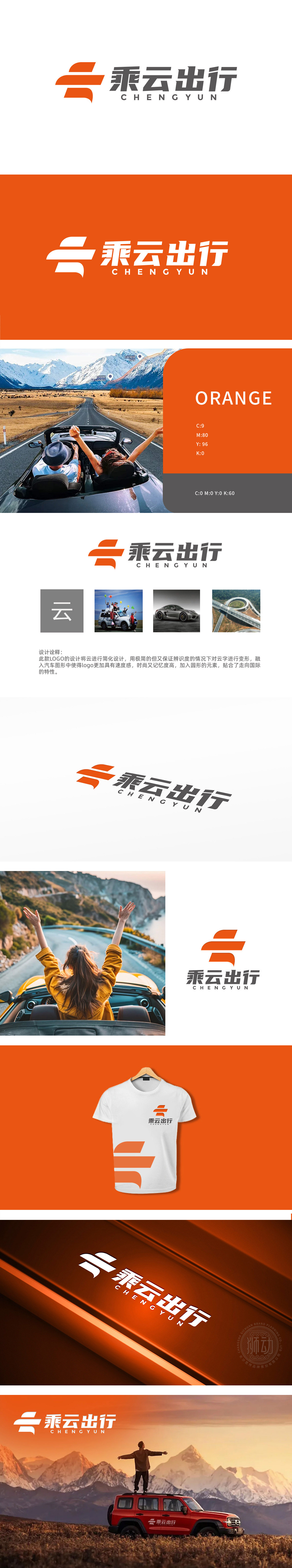
狮动设计以“云”为核心视觉符号,通过极简线条与动态造型,精准传递“互联网+出行”的双重属性::橙色图形由三条流线型色块构成,既抽象化演绎“云”的飘逸形态,又通过倾斜角度与聚合趋势,模拟汽车飞驰时的气流轨迹或道路延伸感,巧妙融入“出行”行业特征。整体设计精准捕捉了“互联网+出行”的行业本质,通过符号简化、场景关联、战略预埋三重设计逻辑,既展现了品牌科技属性与服务场景的融合,极简美学与品牌战略的统一。
Lion Motion design takes "cloud" as the core visual symbol, and accurately conveys the dual attributes of "internet plus Travel" through minimalist lines and dynamic modeling: the orange figure is composed of three streamlined color blocks, which not only abstractly deduces the elegant form of "cloud", but also simulates the airflow trajectory or road extension when the car is speeding through inclination angle and aggregation trend, and skillfully integrates into the characteristics of "travel" industry.The overall design accurately captures the industry essence of "internet plus Travel". Through the triple design logic of symbol simplification, scene correlation and strategy embedding.


扫码或拨打添加客服微信


