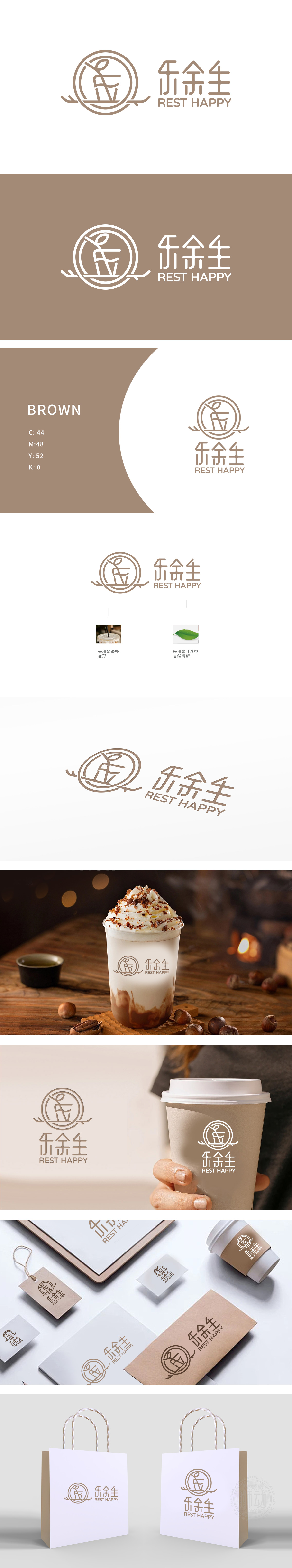
狮动设计以极简线条勾勒出“奶茶杯”轮廓,杯身呈竖长造型,杯口微微外扩,下方搭配横向线条模拟杯底,整体简洁利落,符合现代餐饮品牌的“轻盈感”需求。杯口延伸出一根斜向线条,既像插入杯中的吸管,又似杯沿自然飘出的蒸汽/香气,动态感十足,传递出奶茶饮用时的即时享受,乐”传递愉悦、放松的消费体验,“余笙”谐音“余生”,暗含“享受此刻,美好延续”的情感共鸣,与奶茶作为“日常治愈系饮品”的定位高度契合。
Lion design outlines the outline of "milk tea cup" with minimalist lines. The cup body is vertical and long, the mouth of the cup is slightly expanded, and the bottom of the cup is matched with horizontal lines to simulate the bottom of the cup. The whole is simple and neat, which meets the "lightness" demand of modern catering brands. An oblique line extends from the mouth of the cup, which is not only like a straw inserted into the cup, but also like steam/aroma floating naturally along the edge of the cup. It is full of dynamic feeling, conveying the instant enjoyment of milk tea when drinking, and "music" conveying the pleasant and relaxed consumption experience.


扫码或拨打添加客服微信


