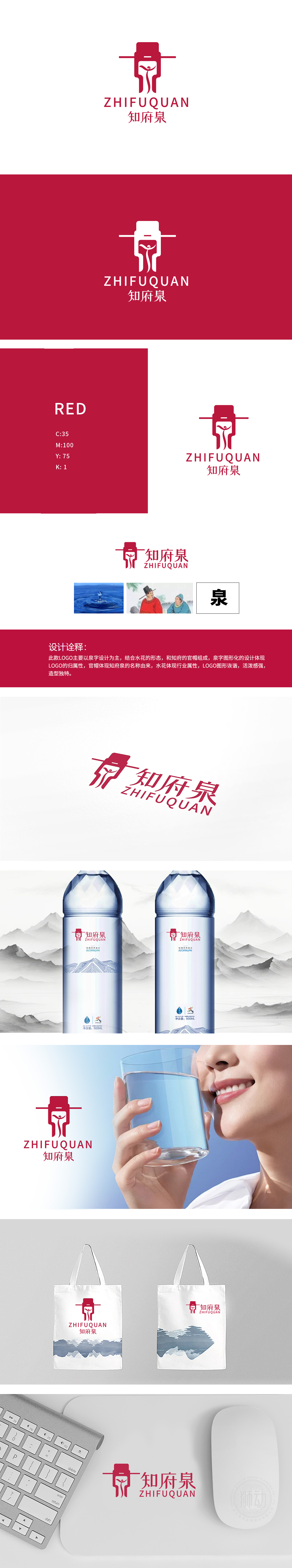
狮动设计以汉字“泉”为原型进行图形化变形,作为LOGO的视觉核心,直接点明品牌名称归属,知府官帽意象: 顶部红色官帽造型,呼应“知府泉”名称中的“知府”文化渊源,赋予品牌历史感与地域文化属性,暗喻品牌如“知府”般可靠、权威的品质承诺。水花形态融入: “泉”字中部及底部线条模拟水花飞溅、水波荡漾的动态形态,直观体现矿泉水行业属性,传递水源纯净、活力的产品特质。整体造型既保留传统符号的庄重感,又通过水花的灵动线条增添活泼气息。
Lion Design takes the Chinese character "Spring" as the prototype for graphic deformation, and as the visual core of LOGO, it directly points out the ownership of the brand name. The image of the official hat of the magistrate: the top red official hat, echoing the cultural origin of the magistrate in the name of "Magistrate Spring", endows the brand with a sense of history and regional cultural attributes, and implies that the brand is as reliable and authoritative as the magistrate. Splash form integration: the middle and bottom lines of the word "Spring" simulate the dynamic form of splash and water ripple.


扫码或拨打添加客服微信


