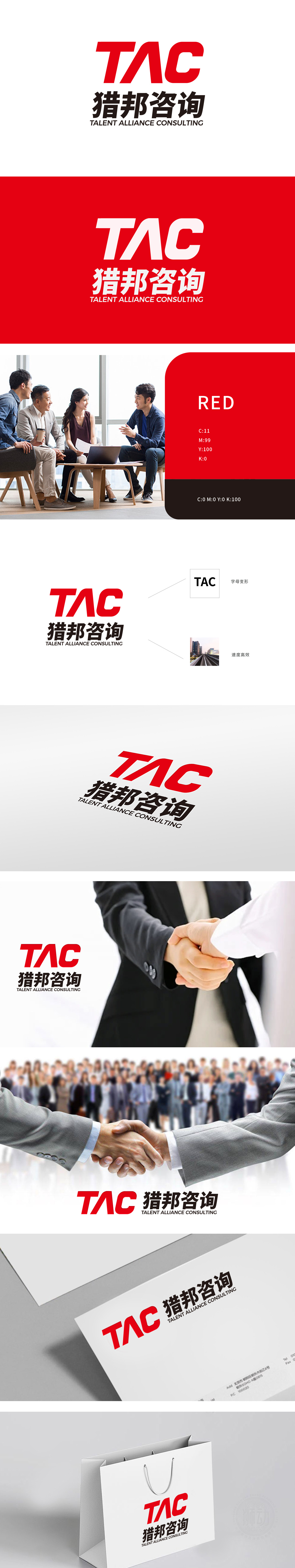
狮动设计以TAC”字母变形设计——极简主义中的力量感,“T”的竖线与“A”的斜线形成锐角切割,“C”的收尾以流畅曲线平衡整体硬朗感,既保留英文缩写的识别性,又通过笔画的“断裂-连接”传递“人才联盟(Alliance)”的协作属性。暗合咨询行业“解决问题、推动发展”的核心价值,红色作为LOGO主体色,在商业设计中常用于传递“活力、决心与紧迫感”,精准匹配猎头行业“主动出击、高效猎聘”的业务特性;整体通过“字母缩写+中文全称+视觉符号”的三重信息架构,让客户快速建立“TAC=猎邦咨询=人才联盟咨询”的认知关联;形成“看到LOGO即联想到价值”的条件反射。
Lion's design is based on the variation of TAC, a sense of power in minimalism. The vertical line of "T" and the diagonal line of "A" form an acute cut, and the ending of "C" balances the overall sense of toughness with a smooth curve, which not only retains the recognition of English abbreviations, but also conveys the cooperative attribute of "Alliance" through the "fracture-connection" of strokes. It coincides with the core value of "solving problems and promoting development" in consulting industry. As the main color of LOGO, red is often used to convey "vitality, determination and urgency" in business design.


扫码或拨打添加客服微信


