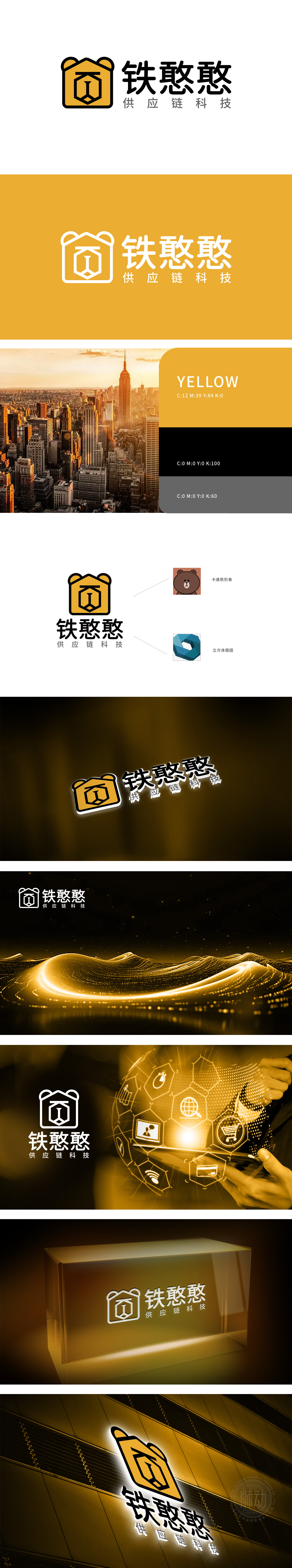
狮动设计通过“熊耳”和抽象面部符号,巧妙融入“铁憨憨”名称中的“憨”字联想——卡通熊形象,传递亲切、诚信、踏实的品牌性格,外形采用房屋轮廓:六边形传递“稳定、可靠”的视觉感受,呼应供应链行业对“安全履约、稳固交付”的核心诉求;黄色作为主色调,象征活力、效率与温暖,整体设计将“熊”(品牌人格)、“房屋”(安全/供应链节点)、“立方体”(稳固/科技)三大核心概念浓缩为一个简洁图形,实现“一眼识别、多元联想”。传达“立体协同、结构稳固”,强化科技属性中的“系统化、可信赖”特质。
Lion Design ingeniously integrates the word "Han" in the name of "Tie Han Han"-cartoon bear image through "Bear Ear" and abstract facial symbols, conveying cordial, honest and down-to-earth brand character. The shape adopts the house outline: hexagon conveys the visual feeling of "stability and reliability", echoing the core demands of the supply chain industry for "safe performance and stable delivery"; As the main color, yellow symbolizes vitality, efficiency and warmth. The overall design condenses the three core concepts of "bear" (brand personality), "house" (security/supply chain node) and "cube" (stability/technology) into a simple figure.


扫码或拨打添加客服微信


