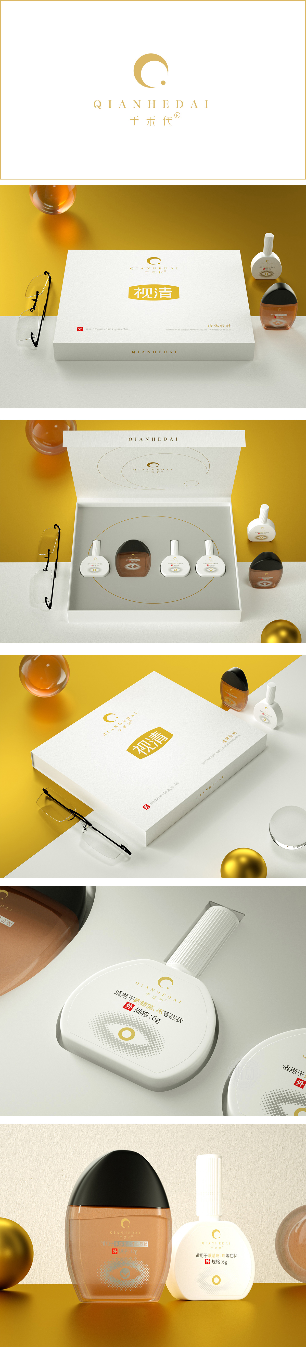
狮动设计以白色为主色调,搭配哑光纹理,既符合医疗健康产品的“专业感”,又传递出“干净、温和”的眼部护理属性;中间黄色矩形块+加粗“视清”大字的设计堪称“视觉锚点”——黄色在视觉心理学中关联“活力、清晰”,与“视清”的产品功能强绑定,“视清”字样的烫金工艺(推测)与黄色块的压纹处理,则在简洁中增添了一丝“高端感”,平衡了“医疗属性”与“消费升级”的用户需求。
Lion design is mainly white with matte texture, which not only conforms to the "professional sense" of medical and health products, but also conveys the "clean and gentle" eye care attributes; The design of yellow rectangular block in the middle and bold "ShiQing" Chinese characters can be called "visual anchor"-yellow is associated with "vitality and clarity" in visual psychology, which is strongly bound to the product function of "ShiQing". The bronzing process (speculation) of "ShiQing" and the embossing treatment of yellow block add a touch of "high-end" to simplicity, balancing.


扫码或拨打添加客服微信


