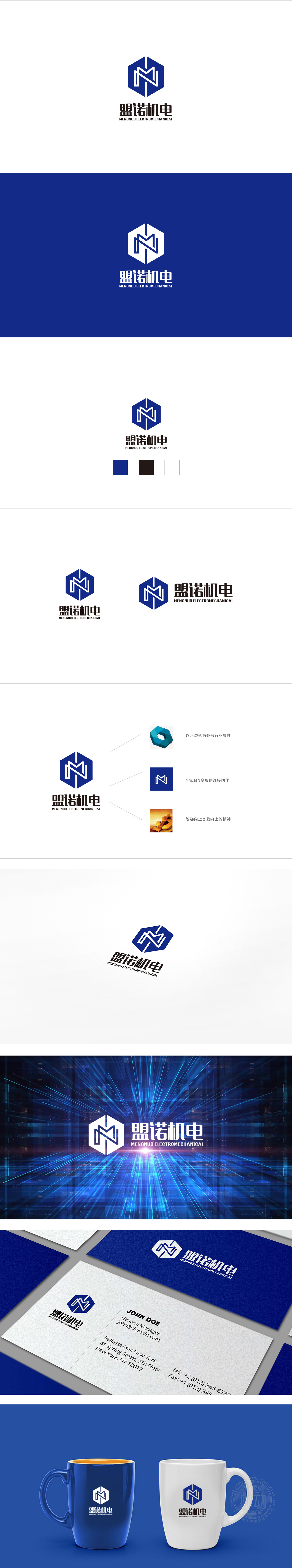
狮动设计采用深蓝色六边形+白色抽象「M」**的组合,每一个元素都在强化品牌的核心诉求:「盟」(联盟/合作):六边形的「包容性」+「M」的「对称结构」,暗示「与客户、伙伴协同共赢」;「诺」(承诺/诚信):深蓝色的「可靠感」+ 字体的「方正感」,传递「信守质量、服务的承诺」;「机电」(行业属性):六边形的「工业感」+「M」的「机械符号」,直接关联「机械电子」的核心业务。通过「几何符号的视觉编码」+「经典色彩的心理暗示」+「极简字体的信息传递」,完美贴合了「盟诺机电」的品牌定位,传递、诚信、专业的机电企业品牌形象。
Lion Design adopts the combination of dark blue hexagon and white abstract "M" , and each element is strengthening the core appeal of the brand: "Alliance" (alliance/cooperation): the hexagonal "inclusiveness"+"M" symmetrical structure ",implying" win-win cooperation with customers and partners ";"Promise" (promise/honesty): the dark blue "sense of reliability"+the font "sense of founder" conveys "the promise of keeping quality and service"; "Electromechanical" (industry attribute): hexagonal "industrial sense"+"mechanical symbol" of "M" is directly related to the core business of "mechatronics".


扫码或拨打添加客服微信


