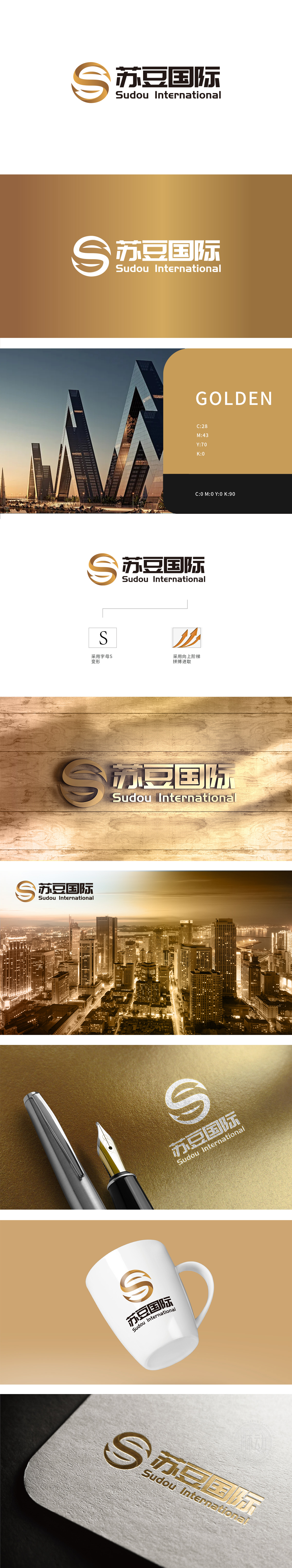
狮动设计将品牌名称首字母 “S” 为核心,通过流畅的环绕式曲线形成闭环结构,既保留了字母的识别性,又传递出 “全球化布局、资源整合闭环” 的视觉隐喻,契合国际企业“连接全球、高效流通”的业务特质。 “向上阶梯” 意象,叠加橙金色箭头的动态趋势,通过线条的斜向上升感强化 “增长、突破、价值提升” 的品牌主张。整体设计精准锚定行业的核心诉求:既有“连接全球、稳健可靠”的专业形象,又传递“创新突破、价值共创”的品牌精神。
Lion design takes the initial letter "S" of the brand name as the core, and forms a closed-loop structure through a smooth loop curve, which not only retains the recognition of letters, but also conveys the visual metaphor of "closed-loop global layout and resource integration", which is in line with the business characteristics of "connecting the world and circulating efficiently" of international enterprises. The image of "upward ladder" is superimposed with the dynamic trend of orange and golden arrows, and the brand proposition of "growth, breakthrough and value promotion" is strengthened through the oblique rising feeling of lines.


扫码或拨打添加客服微信


