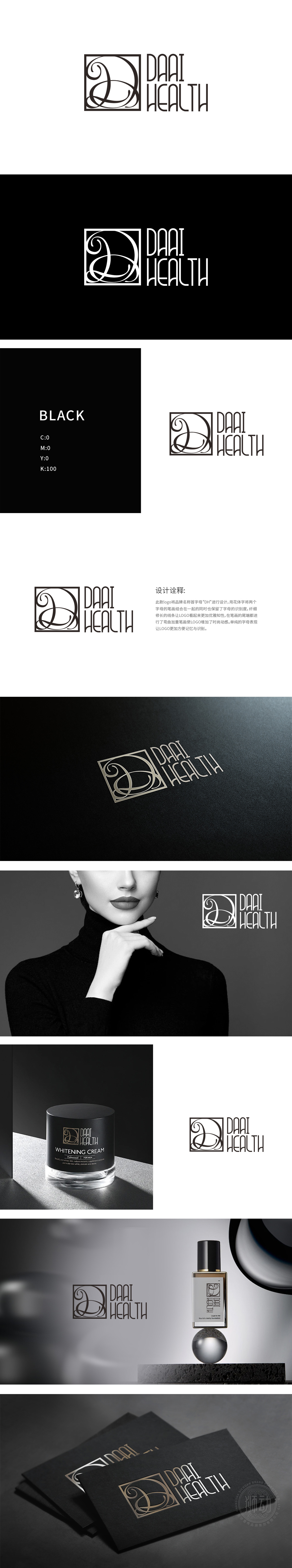
狮动设计以品牌名称首字母“D”和“H”为核心,通过花体字设计将两者笔画有机缠绕:“D”以流畅的曲线勾勒出螺旋上升的卷花形态,“H”的竖直线条巧妙嵌入“D”的尾部卷曲中,既保留了字母本身的识别性,又形成“你中有我、我中有你”的视觉连贯性,隐喻品牌“健康与美丽的交融共生”。通过“曲线+花体+方形”的组合,精准触达日化美容消费者的核心诉求——既追求产品的“专业性”,又向往使用过程的“仪式感”与“美感”。刚柔并济的对比强化了“科学护肤”的品牌定位。
Lion design takes the initials "D" and "H" of the brand name as the core, and the strokes of the two are organically intertwined through the cursive design: "D" outlines the spiraling flower shape with a smooth curve, and the vertical line of "H" is cleverly embedded in the tail curl of "D", which not only retains the recognition of the letters themselves, but also forms the visual coherence of "You have me and I have you", which symbolizes the brand. Through the combination of "curve+pattern+square", we can accurately reach the core demands of daily chemical beauty consumers-not only pursuing the "professionalism" of products.


扫码或拨打添加客服微信


