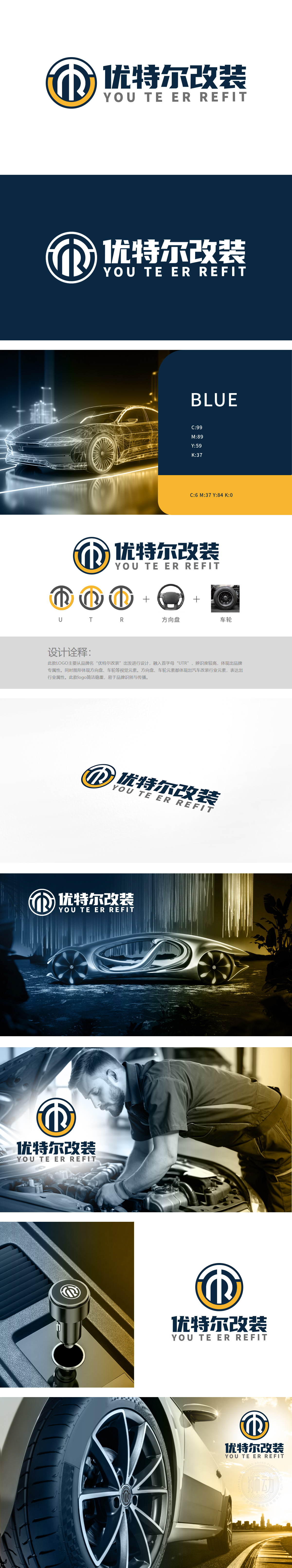
狮动设计以“优特尔改装”首字母“U、T、R”为设计原点,通过线条的抽象融合形成闭环结构:“U”:左侧半环以圆润线条呈现,象征方向盘的握持感与操控的灵活性;“T”:中部垂直线条贯穿环形,强化结构稳定感,暗合改装行业对“安全”与“精准”的核心诉求;“R”:右侧半环收尾处的内折弧度,既呼应“R”的字母形态,又巧妙模拟车轮轮毂的辐条纹理,直接关联汽车改装的核心部件。 三者融合为一个紧凑的环形图标,既保留字母识别性,又通过“闭环”传递品牌服务的完整性(从设计到落地的全流程改装服务)。用线条定义性能,用符号点燃热爱。
Lion Design takes the initials "U, T, R" of "Utel Modification" as the design origin, and forms a closed-loop structure through the abstract fusion of lines: "U": the left half ring is presented with rounded lines, symbolizing the grip and control flexibility of the steering wheel; "T": the vertical lines in the middle run through the ring, which strengthens the sense of structural stability and coincides with the core demands of the refitting industry for "safety" and "accuracy"; "R": The inward folding radian at the end of the right half ring not only echoes the letter form of "R", but also skillfully simulates the spoke texture of the wheel hub.


扫码或拨打添加客服微信


