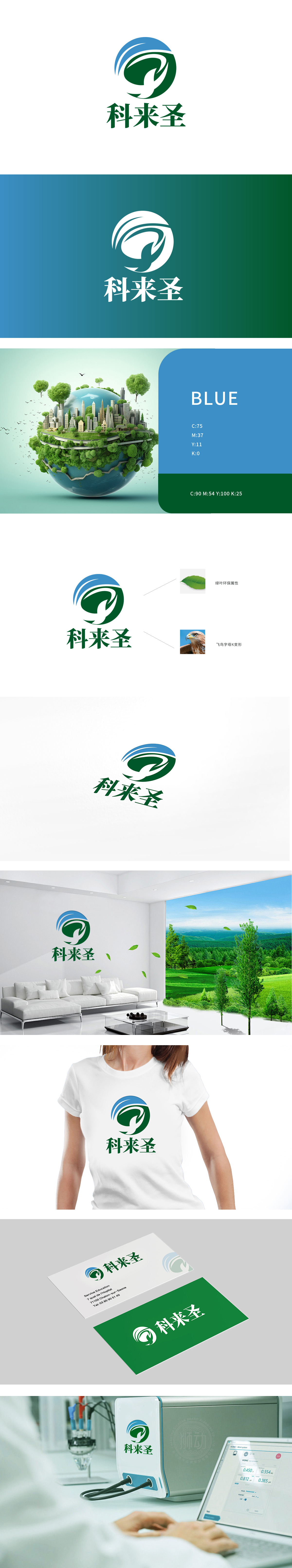
狮动设计以舒展的飞鸟形态为核心,巧妙融合品牌名称首字母“K”的变形:飞鸟昂首向上,翅膀线条流畅且富有张力,既呼应了“科来圣”首字母“K”的识别性,又通过鹰隼般的锐志姿态,传递出品牌进取、高效的精神内核,飞鸟轮廓与外围绿色环形结构自然衔接,环形内侧的弧线模拟叶片舒展的形态,形成“飞鸟栖于绿叶/自然”的意象闭环。 整体将“科技符号(字母K)”与“自然意象(飞鸟、绿叶)”无缝融合,打破“科技=工业”的刻板印象,传递“用科技智慧守护自然生态”的品牌理念,契合环保行业“技术创新驱动绿色发展”的内在需求。
Lion design takes the stretched bird shape as the core, and skillfully blends the deformation of the brand name's initials "K": the bird heads up, and the wing lines are smooth and full of tension, which not only echoes the recognition of the initials "K" of "Kelaisheng", but also conveys the enterprising and efficient spiritual core of the brand through the attitude of eagle. The outline of the bird naturally connects with the peripheral green ring structure, and the arc inside the ring simulates the shape of the blade stretching, forming. On the whole, "science and technology symbol (letter K)" and "natural image (birds, green leaves)" are seamlessly integrated.


扫码或拨打添加客服微信


