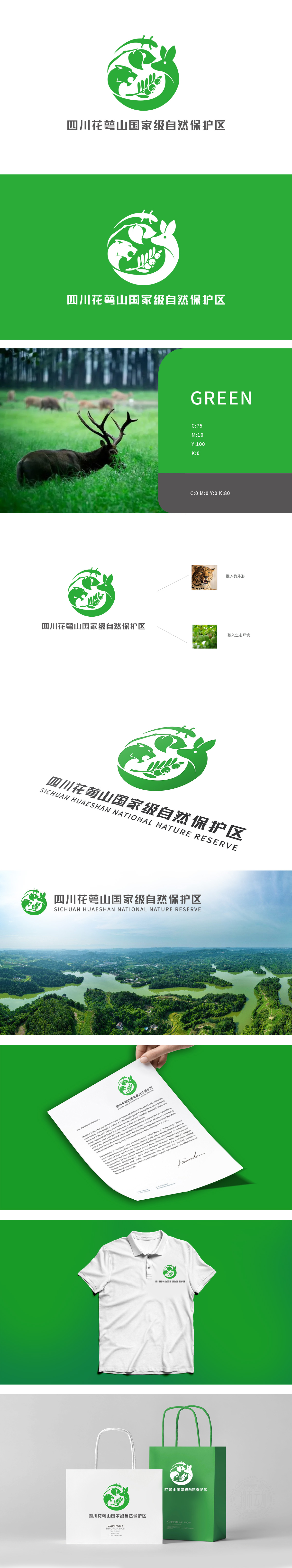
狮动设计采用多元素融合的生态闭环,LOGO主体为圆形环绕设计,象征生态系统的完整性与循环共生,融入豹的头部轮廓(线条凌厉,展现保护区内珍稀野生动物的野性与生命力;鹿的头部剪影,轮廓柔和,与豹形成动静对比,代表生物多样性。植物元素:中间以枝叶与果实作为连接,叶片舒展、果实饱满,既体现保护区的植被丰富性,也象征生态滋养与自然馈赠。环形结构:绿色圆环将动物与植物紧密环绕,寓意“人与自然和谐共生”,同时强化保护区对生态系统的守护职能。通过具象元素抽象化(豹、鹿、植物的简化提炼)和多元素有机融合,在有限图形内浓缩了保护区的“动物多样性”“植物生态”“守护使命”三大核心信息,既具视觉美感,又精准传递了自然保护区的公益属性与生态价值,充分展现了其在品牌视觉表达上的专业能力。
Lion's design adopts an ecological closed loop with multi-element fusion, and the main body of the LOGO is a circular design, which symbolizes the integrity and circular symbiosis of the ecosystem and blends into the head contour of the leopard (the lines are sharp, showing the wildness and vitality of rare wild animals in the reserve; The silhouette of the deer's head is soft, which forms a dynamic and static contrast with the leopard and represents biodiversity. Plant elements: the leaves and fruits are connected in the middle, and the leaves are stretched and the fruits are full, which not only reflects the vegetation richness of the reserve,but also symbolizes ecological nourishment and natural gifts.


扫码或拨打添加客服微信


