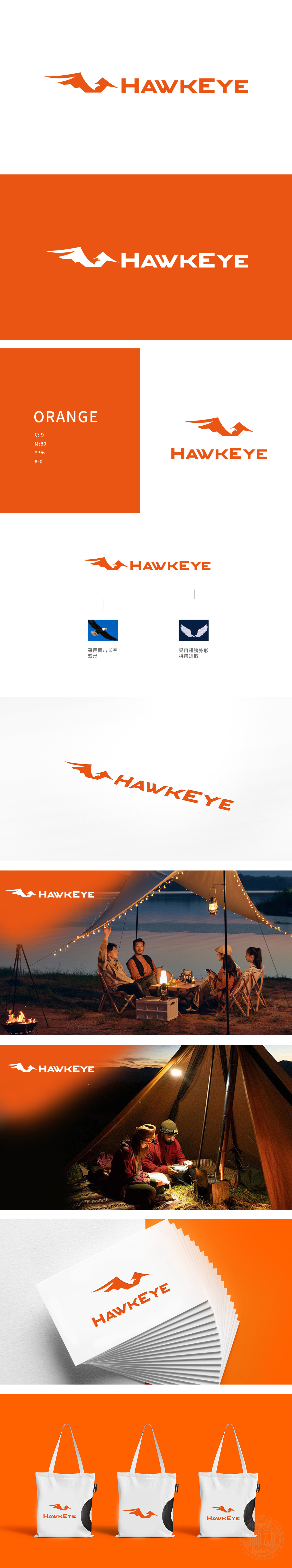
狮动设计将橙色鹰的侧视轮廓为核心,头部锐利前伸,翅膀向后延展呈“V”字形上扬,象征品牌如鹰一般的敏锐与开拓精神。翅膀的延展形态可联想为灯光的“辐射范围”,隐喻产品照明覆盖面广、穿透性强;橙色作为主色调,传递活力、温暖与醒目感,通过“鹰元素抽象化+功能/精神双重隐喻”的策略,成功将户外灯的行业特性(照明、耐用)与品牌个性(进取、精准、活力)融合。
Lion design takes the side profile of the orange eagle as the core, with its sharp head extending forward and its wings extending backward in a "V" shape, which symbolizes the keenness and pioneering spirit of the brand like an eagle. The extension form of wings can be associated with the "radiation range" of light, which means that the lighting coverage of products is wide and penetrating; As the main color, orange conveys vitality, warmth and striking feeling. Through the strategy of "eagle element abstraction+double metaphor of function/spirit".


扫码或拨打添加客服微信


