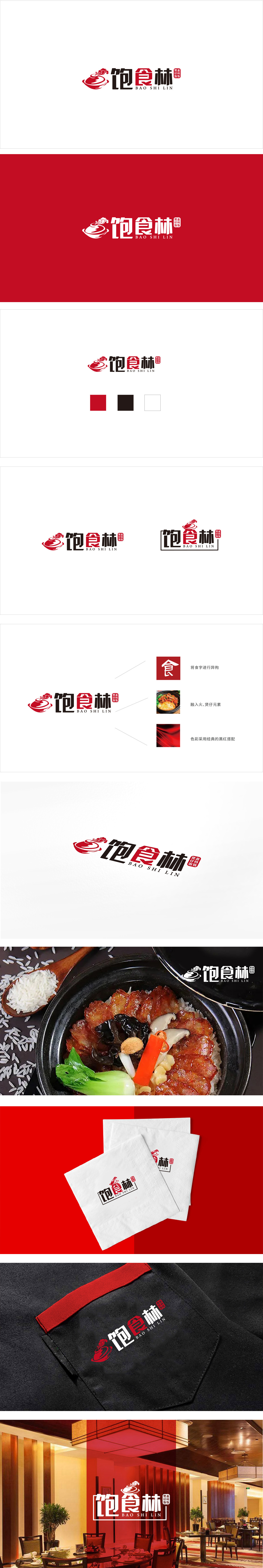
狮动设计采用抽象化的“煲”+“热气”+“云纹”**组合:主体容器:以红色勾勒出一个圆润的“煲”(或碗)的形状,线条流畅且富有体积感,直接关联“餐饮”“食物”的核心场景;热气与云纹:煲口上方的“飘带式热气”与“云纹”结合,既模拟了食物出锅时的热气升腾(传递“新鲜”“热乎”的感官体验),又融入了传统吉祥纹样。主标题“饱食林”,笔画厚重、结构方正,传递“稳重”“可靠”的品牌形象;这种“精准传递+强记忆点”的设计,既符合快餐品牌“高效认知”的需求,又通过传统与现代的平衡,实现了“经典永不过时”的品牌生命力。。
Lion design adopts the abstract combination of "pot"+"hot air"+"moire" * *: the main container: a round pot (or bowl) shape is outlined in red, with smooth lines and a sense of volume, which is directly related to the core scene of "catering" and "food"; Hot air and moire: The combination of "floating hot air" and "moire" above the pot mouth not only simulates the rising of hot air when food is out of the pot (conveying the sensory experience of "freshness" and "warmth"), but also incorporates traditional auspicious patterns. The main title is "full forest", with thick strokes and square structure.


扫码或拨打添加客服微信


