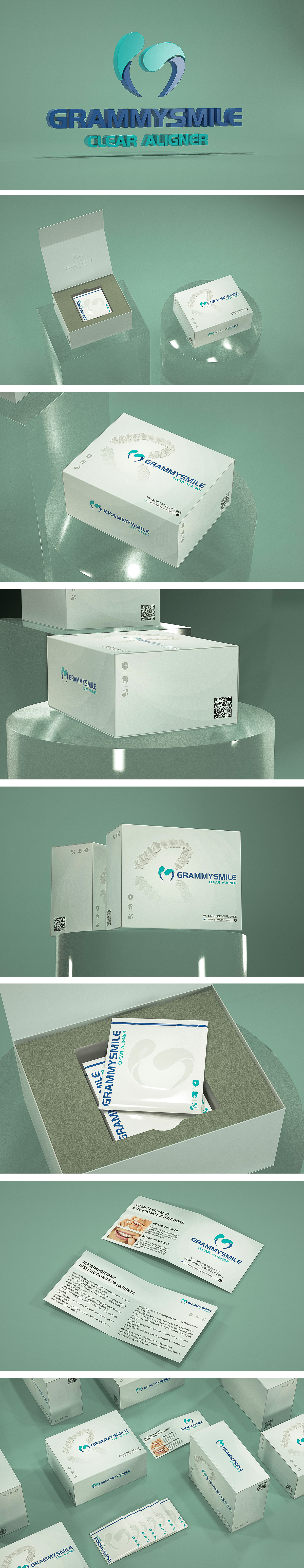
狮动设计通过负空间与对称美学的运用,牙套图形采用对称构图,线条流畅且富有动感,既象征牙齿排列的整齐与平衡,也暗合“矫正”的核心功能;双心环绕的生命力与关怀,中心图形由两片绿色与蓝色“叶片”环绕组成,绿色象征健康、自然,蓝色代表专业、科技与信任感,双元素交织形成保护与呵护的视觉意象,呼应“牙齿护理”的品牌使命,同时传递温暖、人性化的服务理念。低饱和的浅绿色背景+高对比的蓝绿标志,营造清新、洁净的视觉氛围,符合口腔护理产品对“卫生、清爽”的心理暗示,用视觉语言精准传递品牌差异化优势,并激发消费者对“理想笑容”的情感共鸣。
Through the application of negative space and symmetrical aesthetics, the lion movement design adopts symmetrical composition, and the lines are smooth and dynamic, which not only symbolizes the neatness and balance of tooth arrangement, but also coincides with the core function of "correction". The vitality and care surrounded by two hearts, the central figure is composed of two green and blue "leaves", green symbolizes health and nature, blue represents professionalism, technology and trust, and the two elements interweave to form a visual image of protection and care, echoing the brand mission of "dental care" and conveying the warm and humanized service concept.


扫码或拨打添加客服微信


