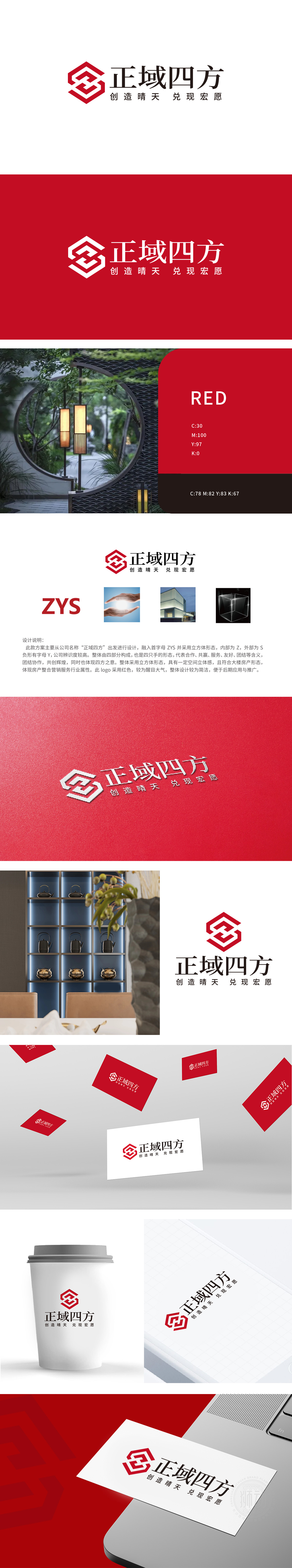
狮动设计以“正域四方”为核心,通过立方体形态暗合“四方”(空间、地域、格局)的中式方位概念,立方体的稳定感传递房地产行业的“坚实、可靠”属性,内部嵌入首字母“Z”、外部“Y”(负形)与“S”的结构,形成“ZYS”的视觉关联,选用正红色作为主色,既是中国传统文化中“吉祥、权威、繁荣”的象征,又增强LOGO在房地产场景中的视觉冲击力,“大气、醒目”。整体设计既通过立方体、红色传递房地产行业的“稳重、权威、可靠”,又以“四方”“协作”“共赢”的理念赋予品牌情感价值,符合中式消费者对“家”的文化期待,更是“团圆、安心”的精神载体。
Lion design takes "positive square" as the core, and through the Chinese orientation concept of "square" (space, region and pattern) in the form of a cube, the sense of stability of the cube conveys the "solid and reliable" attribute of the real estate industry, and the structure of initial "Z", external "Y" and "S" is embedded to form the vision of "ZYS". The overall design not only conveys the "stability, authority and reliability" of the real estate industry through cubes and red, but also endows the brand with emotional value with the concepts of "four directions", "cooperation" and "win-win", which conforms to the cultural expectation of Chinese consumers for "home" and is the spiritual carrier of "reunion and peace of mind"..


扫码或拨打添加客服微信


