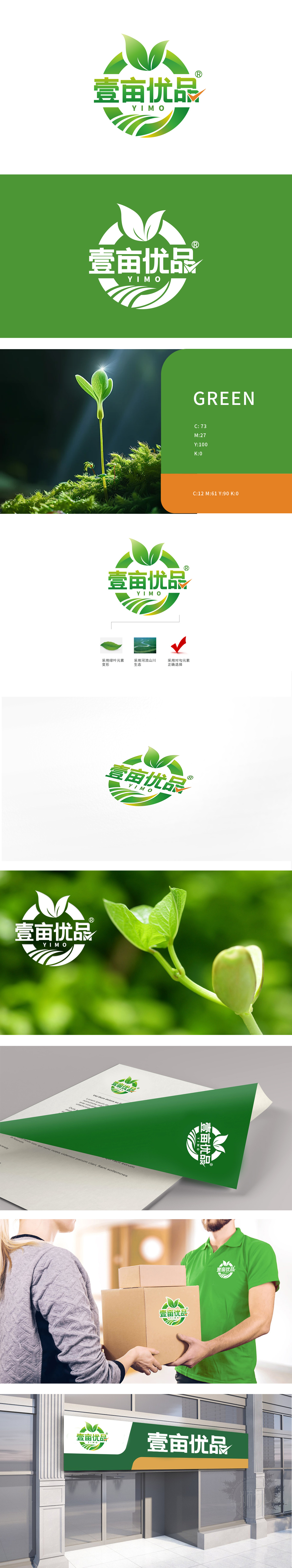
狮动设计采用两片变形绿叶为核心视觉符号,叶片舒展的形态既象征植物生长的活力,也暗合生鲜产品“新鲜采摘”的即时性,强化“生鲜”品类的自然属性。环绕式环形设计将文字与图形包裹其中,形似“生态循环”,隐含生鲜产品从“产地到餐桌”的完整链路,环形的圆满感同时传递“品质保障、安全可信赖”的品牌承诺,,通过自然元素(绿叶、山川)、色彩心理学(绿色)、符号隐喻(对勾、环形) 的三重结合,精准传递“天然、优质,优中选优”的产品定位。
Lion design adopts two deformed green leaves as the core visual symbol, and the shape of the leaves stretching not only symbolizes the vitality of plant growth, but also coincides with the immediacy of "fresh picking" of fresh products, strengthening the natural attributes of "fresh" categories. The circular design wraps characters and graphics in it, which looks like an "ecological cycle", implying the complete link of fresh products from the place of origin to the dining table. The sense of completeness of the ring conveys the brand promise of "quality assurance, safety and trustworthiness" at the same time,.


扫码或拨打添加客服微信


