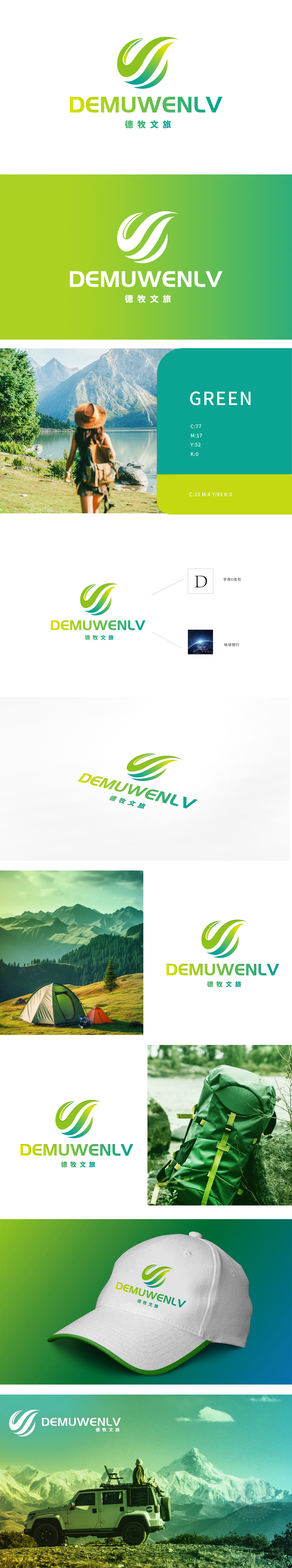
狮动设计以品牌名称首字母「D」为原型,通过流畅的曲线切割与渐变色彩处理,形成「开放、流动、包容」的视觉张力,暗合文旅行业「探索未知、连接多元」的核心价值。螺旋上升的线条传递活力与人文温度,整体呼应「探索地球、体验多元文化」的品牌使命。整体通过「D变形+全球化视角」塑造「专业、创新、有格局」的品牌气质。
Lion design takes the brand name initials "D" as the prototype, and through smooth curve cutting and gradient color processing, it forms the visual tension of "openness, mobility and tolerance", which coincides with the core values of "exploring the unknown and connecting diversity" in the cultural tourism industry. The spiraling lines convey vitality and humanistic temperature, and echo the brand mission of "exploring the earth and experiencing multiculturalism" as a whole.


扫码或拨打添加客服微信


