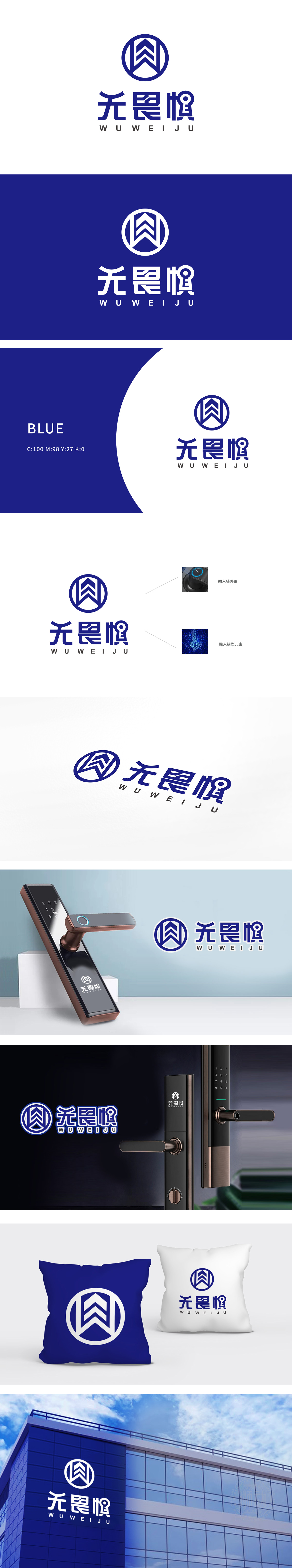
狮动设计将锁具形态的抽象化表达,以深蓝色为主色调,传递专业、安全的品牌气质。圆形轮廓模拟防盗锁的“锁芯外圈”或“控制面板”形态,强化行业属性;内部“W”形折线向上延伸,形似盾牌或山峰,既呼应“无畏”的品牌精神(坚韧、可靠),又象征对安全的守护意象。通过“锁外形+钥匙符号”的双元素植入,实现了品牌名称“无畏惧”与防盗锁行业的深度绑定,整体设计精准传递了“无畏惧”品牌在防盗锁领域的核心定位——以专业安全技术为支撑,为用户带来“无惧威胁”的安心生活体验。
Lion design expresses the lock form abstractly, with dark blue as the main color, and conveys professional and safe brand temperament. The circular outline simulates the "lock cylinder outer ring" or "control panel" shape of the anti-theft lock, which strengthens the industry attribute; The internal "W"-shaped broken line extends upward, shaped like a shield or a mountain peak, which not only echoes the brand spirit of "fearless" (tenacity and reliability), but also symbolizes the guardian image of safety.


扫码或拨打添加客服微信


