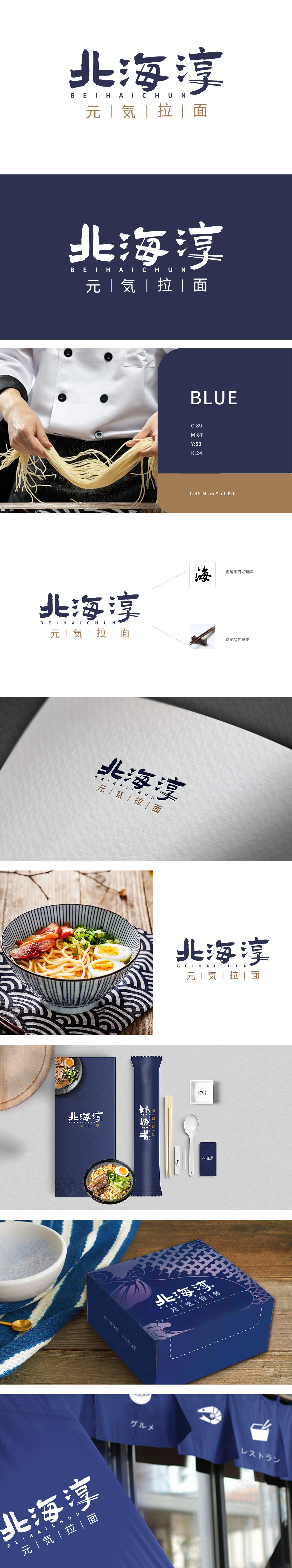
狮动设计采用毛笔书法字体为核心设计,字形融合日式书法的凝练与汉字的结构美感:传递日式美学底蕴,笔触舒展如海浪,既呼应“北海”的地域意象,又通过毛笔的墨韵质感传递日式餐饮的“匠心”与“自然”属性,以“筷子品尝鲜美”的视觉符号,传递“天然、质朴”的食材理念,整体设计既有日式餐饮的经典美学基因,又通过“北海”“淳”等汉字元素保留本土文化亲和力,实现了“日式风格本土化落地”的平衡,让消费者“未见其店,先感其味”。
Lion Design adopts the calligraphy font of brush as the core design, and the glyph combines the conciseness of Japanese calligraphy with the structural beauty of Chinese characters: it conveys the Japanese aesthetic connotation, and the strokes stretch like waves, which not only echoes the regional image of "Beihai", but also conveys the "ingenuity" and "nature" attributes of Japanese catering through the Mo Yun texture of brush, and conveys the "natural and simple" food concept with the visual symbol of "chopsticks taste delicious".


扫码或拨打添加客服微信


