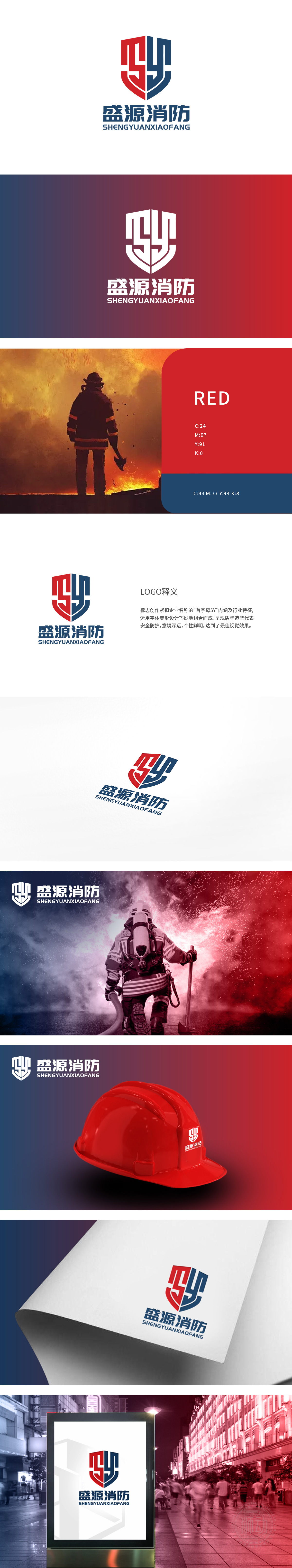
狮动设计以企业名称“盛源消防”首字母“S”和“Y”为创意核心,转折与闭合,形成盾形轮廓,既辨识度高,又强化了“安全防护”的核心意象——盾牌作为经典的守护符号,直接传递消防行业“防灾护安”的使命。红色:代表火焰、警示与热情,呼应消防行业与“火”相关的核心场景,同时传递企业积极主动的服务态度;蓝色:象征专业、冷静与可靠,对应消防工作中“科学施救”“安全保障”的专业属性,冷暖色对比增强视觉冲击力,符合应急行业的视觉认知习惯。整体通过“首字母解构+行业符号融合+色彩心理学应用”,成功为“盛源消防”打造了兼具 识别性、专业性与情感共鸣 的LOGO。
Lion Design takes the initials "S" and "Y" of the enterprise name "Sheng Yuan Fire Protection" as the creative core, turning and closing to form a shield-shaped outline, which not only has high recognition, but also strengthens the core image of "safety protection"-the shield as a classic guardian symbol, and directly conveys the mission of "disaster prevention and safety protection" in the fire protection industry. Red: stands for flame, warning and enthusiasm, echoes the core scene related to "fire" in the fire protection industry, and at the same time conveys the proactive service attitude of enterprises; Blue symbolizes professionalism, calmness and reliability, and corresponds to the professional attributes of "scientific rescue" and "safety guarantee" in fire fighting work.


扫码或拨打添加客服微信


