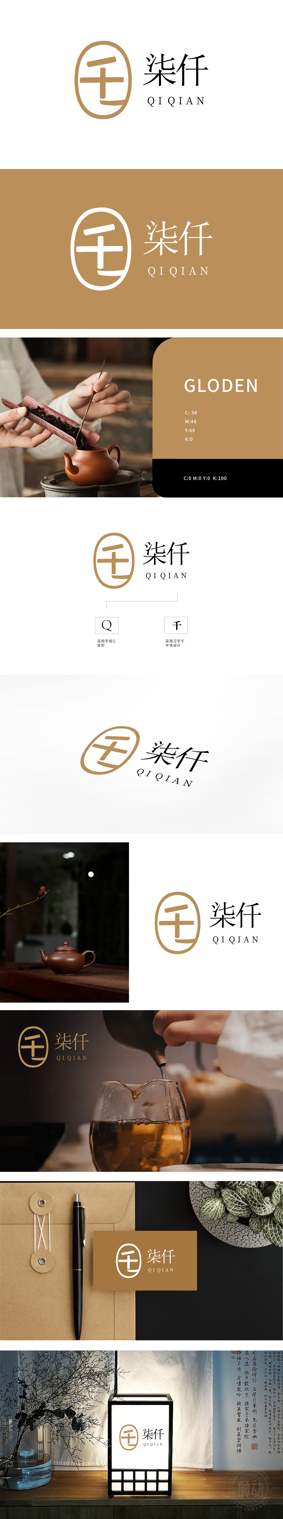
狮动设计以汉字“千”与字母“Q”的融合,暗藏茶道意境,整体呈椭圆形闭环,似一枚茶饼或茶盏的俯视剪影:“千”字的横、竖笔画采用温润的圆角处理,竖笔略微倾斜,如同茶荷中倾斜的茶则,或茶汤注入杯中的动态弧线,传递茶道“行云流水”的韵律感。椭圆形外框象征茶饼的规整形态,也暗合传统茶席中“天圆地方”的哲学观,体现茶文化的内敛与包容。字母“Q”的轮廓,与“千”字笔画无缝衔接,既强化了品牌名称“柒仟(QI QIAN)”的识别性,又以“Q”的“Question”(探索)寓意——象征对千年茶文化的探寻与传承,赋予现代品牌年轻化的解读。通过“千”字传递历史感,以简约设计呼应茶道“和、敬、清、寂”的精神内核。
Lion design hides the artistic conception of the tea ceremony by combining the Chinese character "Qian" with the letter "Q", and the whole design is oval and closed-loop, which looks like a silhouette of a tea cake or a tea cup. The horizontal and vertical strokes of the word "Qian" are treated with moist rounded corners, and the vertical strokes are slightly inclined, which is like an inclined Chaze in a tea lotus or a dynamic arc of tea soup injected into a cup, conveying the rhythm of the tea ceremony. The oval frame symbolizes the regular shape of tea cakes, and also coincides with the philosophical view of "heaven and round place" in traditional tea seats, reflecting the introversion and tolerance of tea culture. The outline of the letter "Q" is seamlessly connected with the strokes of the word "Qian".


扫码或拨打添加客服微信


