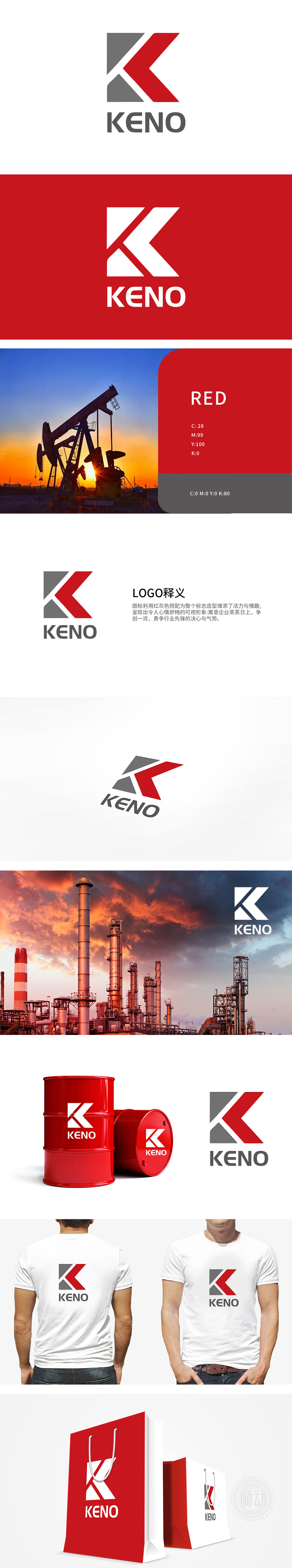
狮动设计将几何化的“K”字为核心,红色与灰色的锐利切割线条形成向上的动态趋势,既传递出力量感与稳定,又通过斜向线条的延伸感象征“突破”与“前瞻”。红色斜向线条呈45°向上延伸,突破灰色基底的包裹,既像钻井平台的钻杆刺破地表的动态瞬间,又暗合“能源开发向纵深突破”的行业特质,传递企业在勘探、开采、技术研发上的“进取姿态”。整体用抽象符号承载行业共性,用色彩与结构传递品牌个性,最终实现“专业可信”与“先锋进取”的双重价值表达。
Lion design takes the geometric "K" as the core, and the sharp red and gray cutting lines form an upward dynamic trend, which not only conveys the sense of output and stability, but also symbolizes "breakthrough" and "foresight" through the extension of oblique lines. The red oblique line extends upward at 45 degrees, breaking through the package of gray base, which is not only like the dynamic moment when the drill pipe of the drilling platform pierces the surface, but also coincides with the industry characteristic of "energy development breaks through in depth", conveying the "enterprising attitude" of enterprises in exploration, exploitation and technology research and development.


扫码或拨打添加客服微信


