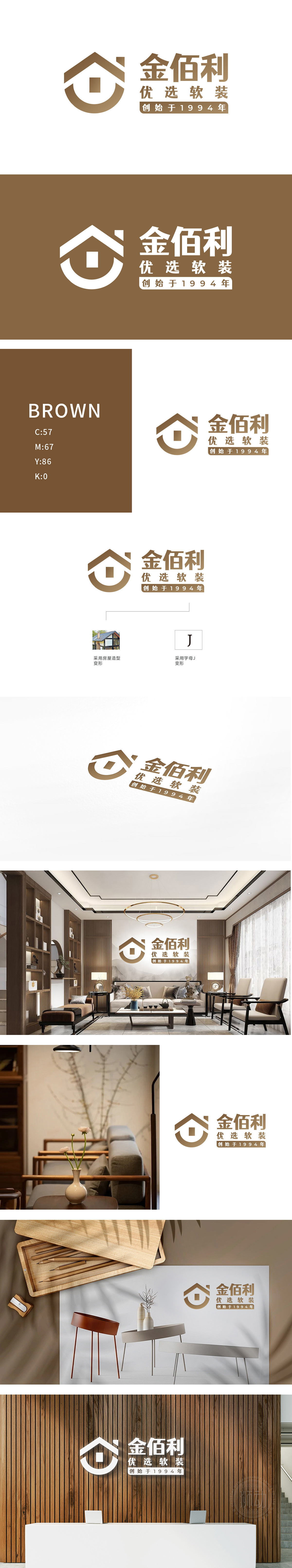
狮动设计以抽象化的“房屋”轮廓为核心,顶部三角形屋顶与下方半圆弧线结合,既保留家的温暖意象,又通过几何简化增强现代感,契合“软装”行业对空间美学的追求。字母“J”变形融合:房屋图形内部隐含字母“J”的弧度,呼应品牌名称“金佰利”首字母“J”(实现品牌名称与行业属性的视觉关联。配色策略:采用深浅棕金色系,传递高端、质感与温暖,符合软装行业对“优选”品质的定位,整体以“房屋+字母”的抽象组合,强化“软装赋予空间温度”的核心价值主张,实现了“视觉符号-品牌认知-商业价值”的闭环。
Lion design takes the abstract "house" outline as the core, and the triangular roof at the top is combined with the semi-circular arc below, which not only preserves the warm image of home, but also enhances the modernity through geometric simplification, which is in line with the pursuit of space aesthetics in the "soft-fitting" industry. Distortion and fusion of the letter "J": The radian of the letter "J" is hidden in the house graphics, which echoes the initial letter "J" of the brand name "Kimberly" (to realize the visual association between the brand name and the industry attributes. Color matching strategy: adopting dark brown and gold series to convey high-end, texture and warmth.


扫码或拨打添加客服微信


