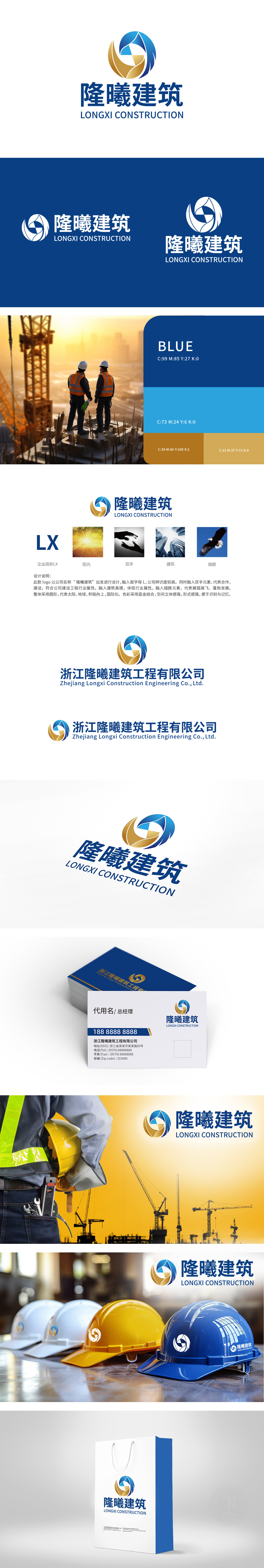
狮动设计以首字母“L”为基础骨架,通过曲线与几何切割形成立体环抱结构,金色部分的折线棱角模拟“高楼剪影”,与“L”的垂直结构结合,强化“建筑工程”的行业属性,蓝金配色经典且富有行业属性,蓝色象征专业、信任与科技感,契合建筑工程的严谨;金色呼应“曦”(晨光),传递温暖、活力与品质感,二者渐变过渡形成空间层次感,凸显立体感。整体通过“字母为形、符号为意、色彩为情”的三层设计逻辑,将企业简称(LX)、行业特征(建筑)、精神理念(合作、发展、温暖)高度浓缩于图形之中,构建“专业可靠+温暖人文+长远发展”的品牌形象,符合建筑企业对“品质、合作、未来”的价值追求。
Lion design takes the initial letter "L" as the basic skeleton, and forms a three-dimensional embracing structure through curve and geometric cutting. The broken edges and corners of the golden part simulate "silhouette of a tall building", which is combined with the vertical structure of "L" to strengthen the industrial attribute of "architectural engineering". The blue gold color scheme is classic and full of industrial attributes, and the blue symbolizes professionalism, trust and scientific sense, which is in line with the rigor of architectural engineering. Gold echoes the "sunrise" (morning light), conveying warmth, vitality and quality. The gradual transition between the two forms a sense of spatial layering, highlighting the three-dimensional sense. Through the three-layer design logic of "letters as shapes.


扫码或拨打添加客服微信


