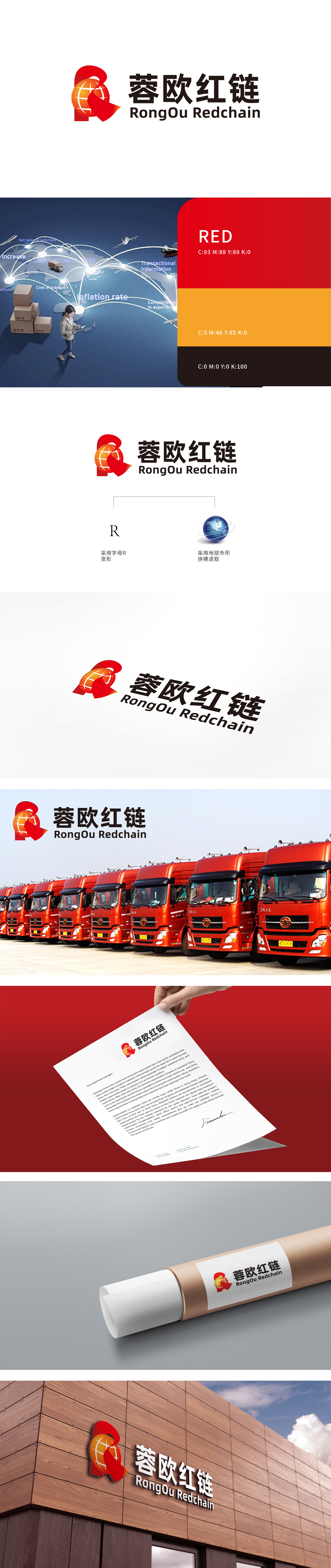
狮动设计以字母“R”变形与红色飘带,字母“R”:作为“蓉(Rong)”的首字母,通过圆润流畅的线条变形构成LOGO主体框架,又通过右侧的开放式设计传递“连接”与“开放”的供应链特性,红色飘带:缠绕于“R”的右侧及顶部,采用高饱和红色(象征活力、信任与中国特色),其灵动的飘动感既强化了视觉张力,又隐喻供应链的“链路流动”与“高效传递”,同时红色也呼应“红链”中的品牌关键词。整体以“R”字母变形为核心符号,通过红飘带、地球等元素的组合,精准传递“蓉欧红链”的三大核心价值:地域属性(蓉欧)、业务本质(供应链/红链)、精神内核(全球化、拼搏进取)。
Lion design is based on the letter "R" deformation and red ribbon. The letter "R", as the initial letter of "Rong", forms the main frame of LOGO through round and smooth line deformation, and conveys the supply chain characteristics of "connection" and "opening" through the open design on the right side. The red ribbon is wound on the right and top of "R" and is made of highly saturated red (symbolizing vitality and openness) Taking the letter "R" as the core symbol, through the combination of red ribbon, earth and other elements, the three core values of "Rongou Red Chain" are accurately conveyed: regional attribute (Rongou), business essence (supply chain/red chain) and spiritual core (globalization and enterprising).


扫码或拨打添加客服微信


