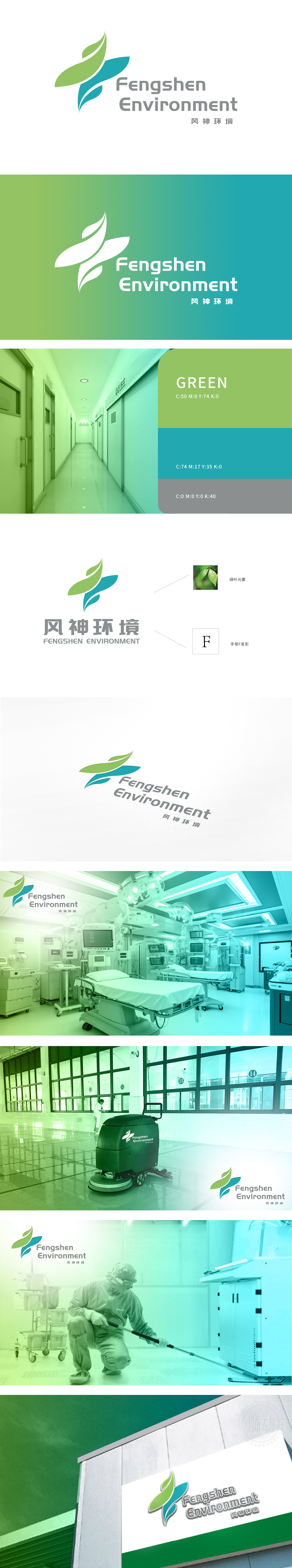
狮动设计以两片抽象化的“绿叶”为核心视觉符号:上方为嫩绿叶片,象征生机与自然;下方为渐变蓝绿叶片,传递清洁、可持续的环境属性。叶片边缘的流畅曲线模拟自然生长的动态感,直观呼应“环境”主题,强化品牌在生态保护、绿色发展领域的定位。绿色系主色调代表环保、健康、可持续,蓝色的融入暗喻“清洁能源”“水环境保护”等细分领域,符合“能源”相关业务的属性联想,整体既有对“风神环境”品牌名称(F字母)的专属定制,又通过自然元素传递环保理念,实现“形(视觉符号)+意(品牌价值)”的统一。
Lion design takes two abstract "green leaves" as the core visual symbol: the light green leaves above symbolize vitality and nature; Below is a gradient of blue and green leaves, which conveys clean and sustainable environmental attributes. The smooth curve of the leaf edge simulates the dynamic feeling of natural growth, intuitively echoes the theme of "environment" and strengthens the positioning of the brand in the field of ecological protection and green development. The main color of green represents environmental protection, health and sustainability, and the integration of blue.


扫码或拨打添加客服微信


