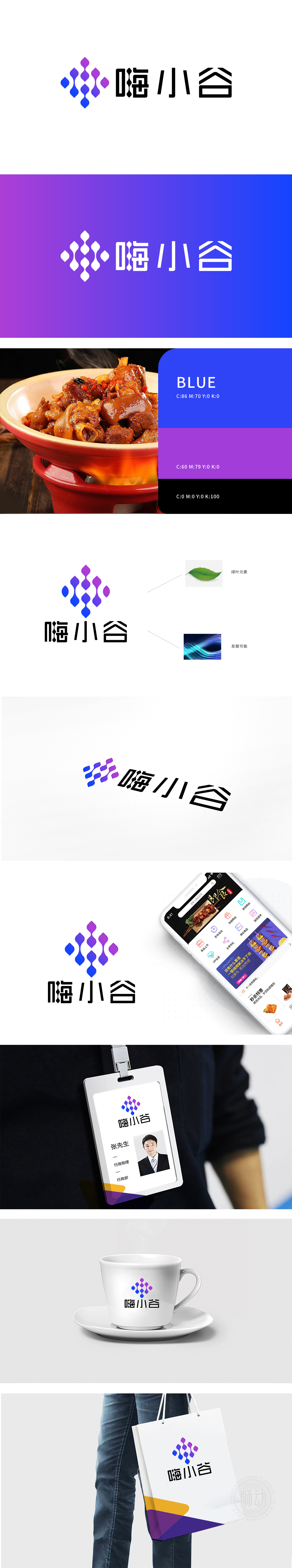
狮动设计由色彩渐变的几何图形构成对称向上的放射状结构,整体呈现灵动的韵律感:从底部深蓝向顶部粉紫渐变,蓝色象征科技、信任,粉紫传递活力与年轻化,色彩过渡自然柔和,符合餐饮行业的亲和力需求。图形形似“谷粒”或“水滴”,呼应品牌名称“嗨小谷”中的“谷”,暗示食材的天然、新鲜,同时多单元的连接感又像“纽带”,体现平台连接用户、商家的互联网属性。图形线条流畅且呈向上延伸趋势,搭配渐变光影,传递平台的成长性与生命力,与“无限发展”的形成呼应。
Lion design is a symmetrical and upward radial structure composed of geometric figures with gradual color changes, showing a smart sense of rhythm as a whole: from deep blue at the bottom to pink purple at the top, blue symbolizes technology and trust, pink purple conveys vitality and youthfulness, and the color transition is natural and soft, which meets the affinity requirements of the catering industry. The graphics are shaped like "grain" or "water drop", echoing the "valley" in the brand name "Hi Xiaogu", suggesting that the ingredients are natural and fresh.


扫码或拨打添加客服微信


