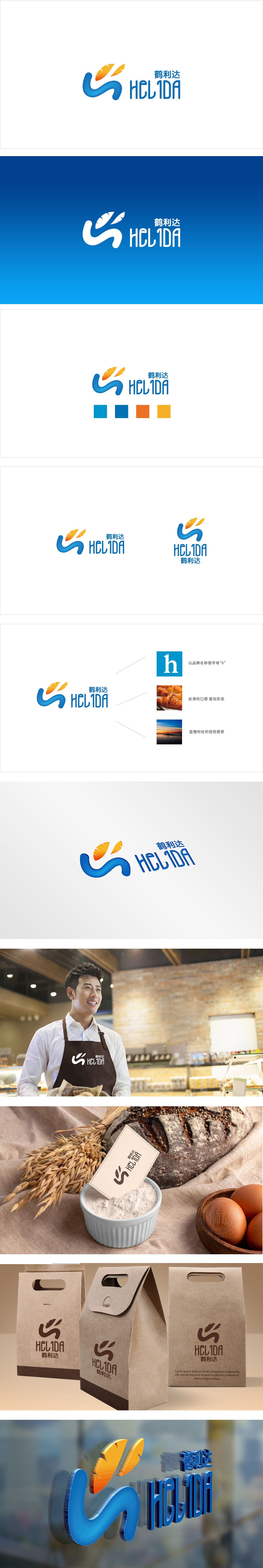
狮动设计以抹蓝曲线摸拟蛋糕底座的弧度,奶油挤出来的自然流动感,软fufu的,瞬间让人联想到刚烤好的烘焙底座;上面两片橙色“小叶子”更绝,明明是抽象的形状,却一眼看出像烤得金黄的面包片、蛋糕上点缀的橙子果肉,甚至是打发的奶油花,自带“刚出炉的香”的画面感!再看颜色:蓝色选得太懂食品行业了,清透又干净,像清晨的阳光照在烘焙坊的玻璃上,给人“新鲜、卫生”的信任感;橙色更是烘焙的“本命色”——烤面包的焦糖色、蛋糕的奶油黄,暖得能溢出甜香,瞬间激活味蕾。整体把“烘焙的本质”(新鲜、美味、手工、温馨)都翻译成了视觉语言,让人垂涎。
Lion design simulates the radian of cake base with blue curve, or the natural flowing feeling of cream extrusion, soft fufu, which instantly reminds people of freshly baked baking base; The above two orange "small leaves" are even more unique. Obviously, they are abstract shapes, but at first glance, they look like golden toast, orange pulp decorated on cakes, and even cream flowers that are sent away, with their own "freshly baked fragrance"! Look at the color again: blue is too familiar with the food industry, clear and clean, like the morning sun shining on the glass of the bakery, giving people a sense of trust of "freshness and hygiene"; Orange is the "life's core monuments color" of baking-caramel color of toast and cream yellow of cake.


扫码或拨打添加客服微信


