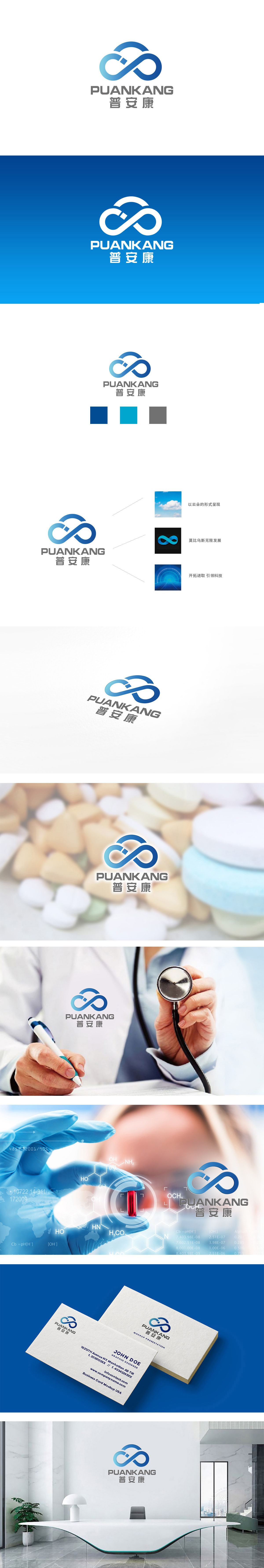
狮动设计采用交错缠绕的「∞」(无限符号),巧妙融合了「云朵」的轮廓:无限符号:直接关联「永恒健康」「持续关怀」的医药核心诉求,暗示品牌对用户健康的长期陪伴;交错结构:像纽带、像双手相握,隐喻「医患连接」「医疗资源整合」,符合当下医药行业「全周期健康管理」的趋势;云朵形态:软化了科技感的「无限符号」,增添了「温暖、包容、安心」的情绪价值,对应医药行业「治愈」「守护」的底层逻辑。蓝色是医药行业的「信任色」,代表专业、可靠;整体调性:简洁但有记忆点,符合医药品牌的传播需求。
Lion design adopts intertwined "∞" (infinite symbol), which skillfully blends the outline of "cloud": infinite symbol: it directly relates to the core demand of medicine of "eternal health" and "continuous care", suggesting that the brand will accompany the health of users for a long time; Staggered structure: like ties, like hands clasping, metaphor of "doctor-patient connection" and "integration of medical resources", in line with the current trend of "full-cycle health management" in the pharmaceutical industry; Cloud form: it softens the "infinite symbol" of the sense of science and technology and adds the emotional value of "warmth, tolerance and peace of mind".


扫码或拨打添加客服微信


