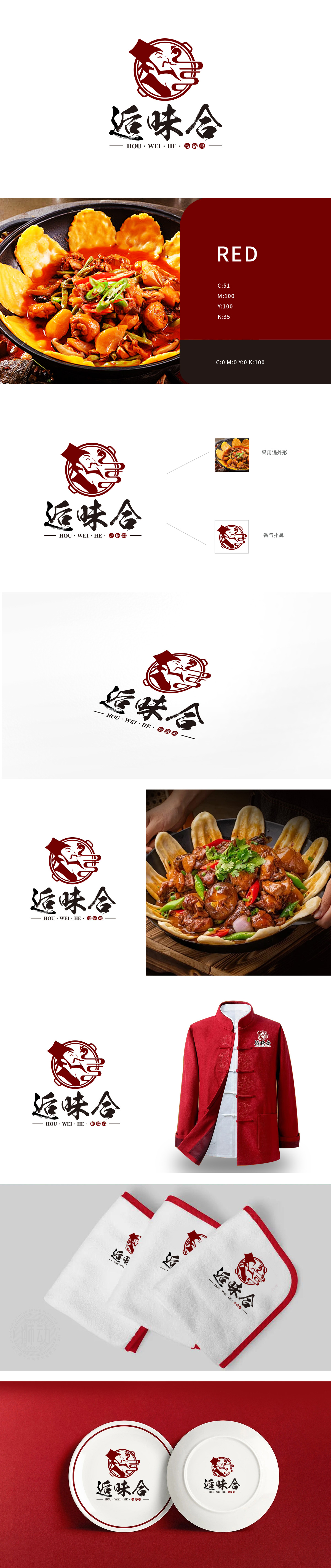
狮动设计以圆形地锅轮廓为核心框架,锅沿的弧度与双耳设计高度还原地锅鸡的烹饪器具特征,直接点明“地锅”品类属性,让消费者第一眼联想到“铁锅炖煮、热气腾腾”的餐饮场景。深红色主调不仅呼应地锅鸡的“红汤、辣香”视觉联想,更传递出传统美食的温暖感与食欲感,符合中餐品牌的经典配色逻辑。锅内嵌入侧脸人物剪影,头部戴传统头巾,闭眼抿嘴的神态搭配上扬嘴角,生动刻画“品尝美味时的满足感”,以人格化形象拉近与消费者的距离,暗喻“地道匠人匠心烹饪”的品牌理念。以“锅”为框,以“人”为魂,从“形”到“意”的完整闭环。
Lion Design takes the outline of a round pot as the core frame, and the radian of pot edge and the design height of ears restore the cooking appliance characteristics of pot chicken, directly pointing out the category attributes of pot, and making consumers think of the "pot-stewed, steaming" dining scene at first sight. The deep red theme not only echoes the visual association of "red soup and spicy flavor" of Diguo chicken, but also conveys the warmth and appetite of traditional food, which conforms to the classic color matching logic of Chinese food brands. Silhouettes of people with side faces are embedded in the pot, traditional headscarves are worn on the head, and the expression of closing eyes and pursed lips is matched with the rising corners of the mouth.


扫码或拨打添加客服微信


