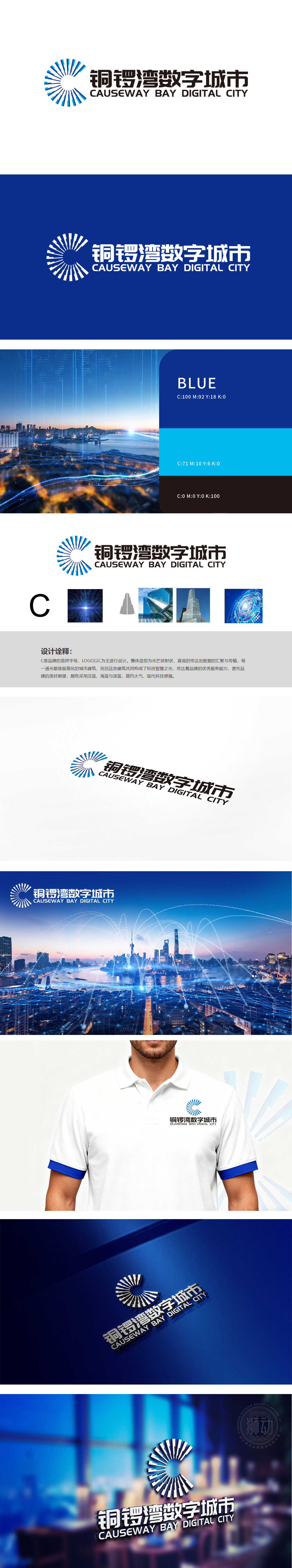
狮动设计以品牌首字母“C”为核心创意原点,通过图形、色彩与辅助视觉元素,构建“数字科技赋能城市发展”的品牌形象,整体呈现简约大气的现代科技感,符合“数字城市”的定位。聚科技与城市的双重基因,每一道“光带”被简化为抽象的“城市建筑剪影”,垂直向上的线条既呼应高楼林立的城市天际线,又通过汇聚中心的“光芒”(白色光圈)传递科技赋能下的“智慧之光”,强化“数字城市”的核心定位。LOGO兼具视觉美感与战略表达,为“铜锣湾数字城市”树立了兼具科技感与城市属性的品牌形象。
Lion Design takes the brand initials "C" as the core creative origin, and constructs the brand image of "Digital Technology Empowers Urban Development" through graphics, colors and auxiliary visual elements, presenting a simple and atmospheric sense of modern technology as a whole, in line with the positioning of "Digital City". Gathering the dual genes of science and technology and the city, each "light belt" is simplified as an abstract "urban building silhouette", and the vertical lines not only echo the urban skyline with high-rise buildings, but also transmit the "light of wisdom" empowered by science and technology through the "light" (white aperture) of the gathering center.


扫码或拨打添加客服微信


