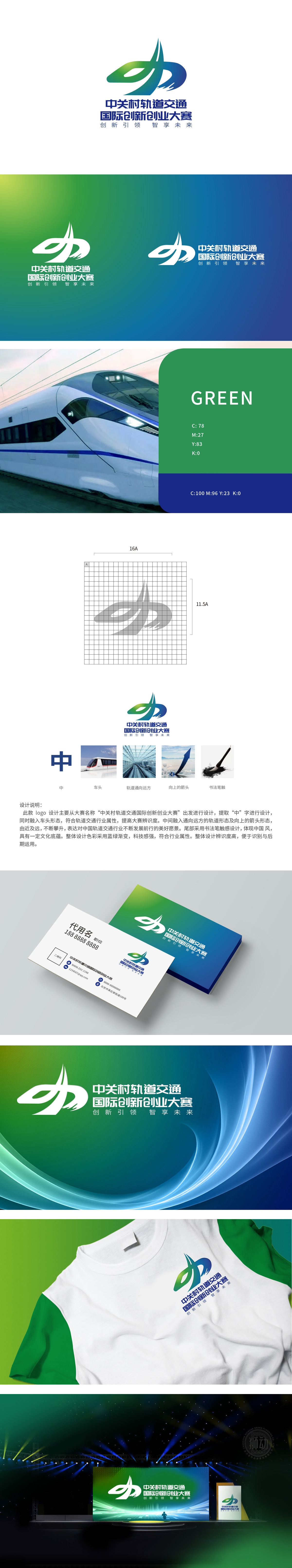
狮动设计以书法笔触勾勒的“中”字为基底,既呼应大赛名称中的“中(关村)”,又通过“中”字的方正感传递“中国”“中心”的行业定位,强化民族品牌与区域属性。轨道交通元素的具象化表达,直观体现“轨道交通”行业特征,增强视觉冲击力。通过“中字+车头+轨道+箭头”的多元素融合,动态与愿景的符号化设计,传递“创新引领、智享未来”的大赛主题,寓意行业突破、企业成长的上升趋势。
Lion Design is based on the character "Zhong" outlined by calligraphy strokes, which not only echoes the word "Zhong (Guan Cun)" in the contest name, but also conveys the industry orientation of "China" and "Center" through the square sense of the word "Zhong", and strengthens the national brand and regional attributes. The concrete expression of rail transit elements directly reflects the characteristics of rail transit industry and enhances the visual impact.


扫码或拨打添加客服微信


